The Poetry of Thick Paint
Episode 79
Episode length: 1 hour and 14 minutes
What gives a painting the power to stop us in our tracks?
For artist Brad Teare, it’s more than subject matter. It’s the energy of the paint itself—the texture, the color, the visible record of the artist’s hand, and the courage to embrace authenticity over perfection. Brad Teare is a Utah-based painter whose expressive landscapes are known for their vibrant color, bold palette-knife work, and richly textured surfaces. Before dedicating himself to fine art, he enjoyed a successful career as an illustrator, creating work for clients including The New York Times and Random House. Today his paintings are represented by galleries throughout the American West and have been featured in numerous museum exhibitions and invitational shows.
In this episode of The Artful Painter, I sit down with Utah landscape painter Brad Teare to explore the philosophy behind his distinctive, richly textured paintings. Brad shares how his career evolved from illustration and woodcut printmaking to becoming one of today’s most recognizable painters of the American West. Along the way, we discuss how seeing Vincent van Gogh’s paintings in person changed his understanding of what paint could do, why artists should resist the temptation to imitate their heroes, and how finding your own artistic voice is a journey every artist must take alone.
One of my favorite moments in our conversation comes when Brad describes texture as more than a visual effect. Every stroke of paint records a decision, preserving the history of its creation and inviting viewers to connect with the artist in a deeply human way. It’s a fascinating discussion about why original paintings possess a presence that photographs and reproductions can never fully capture.
Whether you’re a painter searching for your own voice, a collector interested in what makes original artwork so compelling, or simply someone who appreciates thoughtful conversations about creativity, I think you’ll find plenty to enjoy in this episode.
In this episode:
How Brad transitioned from a successful illustration career into fine art
Why seeing Van Gogh’s paintings in person transformed his approach to painting
The role of texture in creating emotional impact
How woodcut printmaking continues to influence his paintings
Why authenticity matters more than technical perfection
What collectors see—and feel—when standing in front of an original painting
Thanks for listening to The Artful Painter. If you enjoy these conversations, please consider sharing the podcast with a fellow artist or art lover.
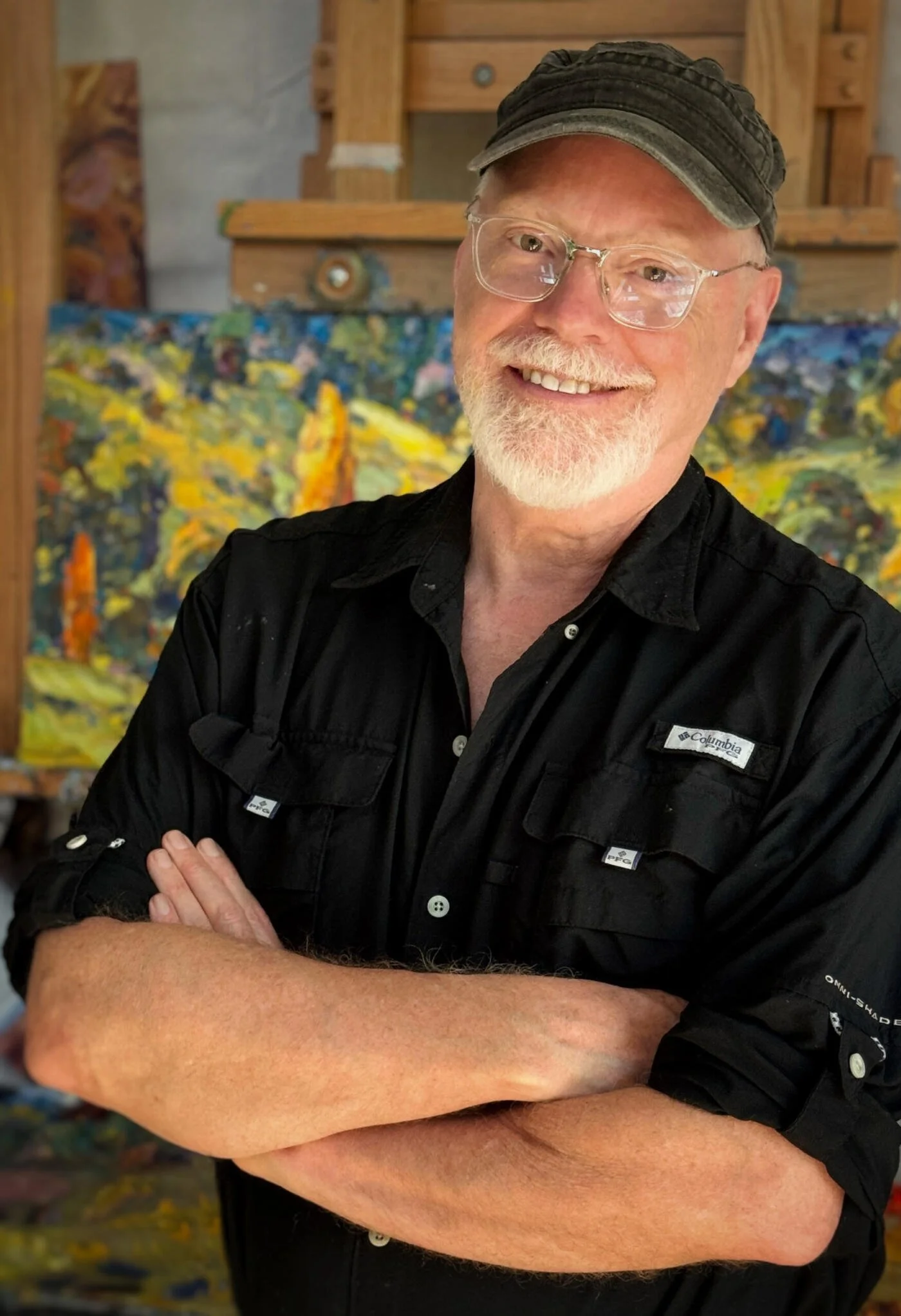
Brad Teare
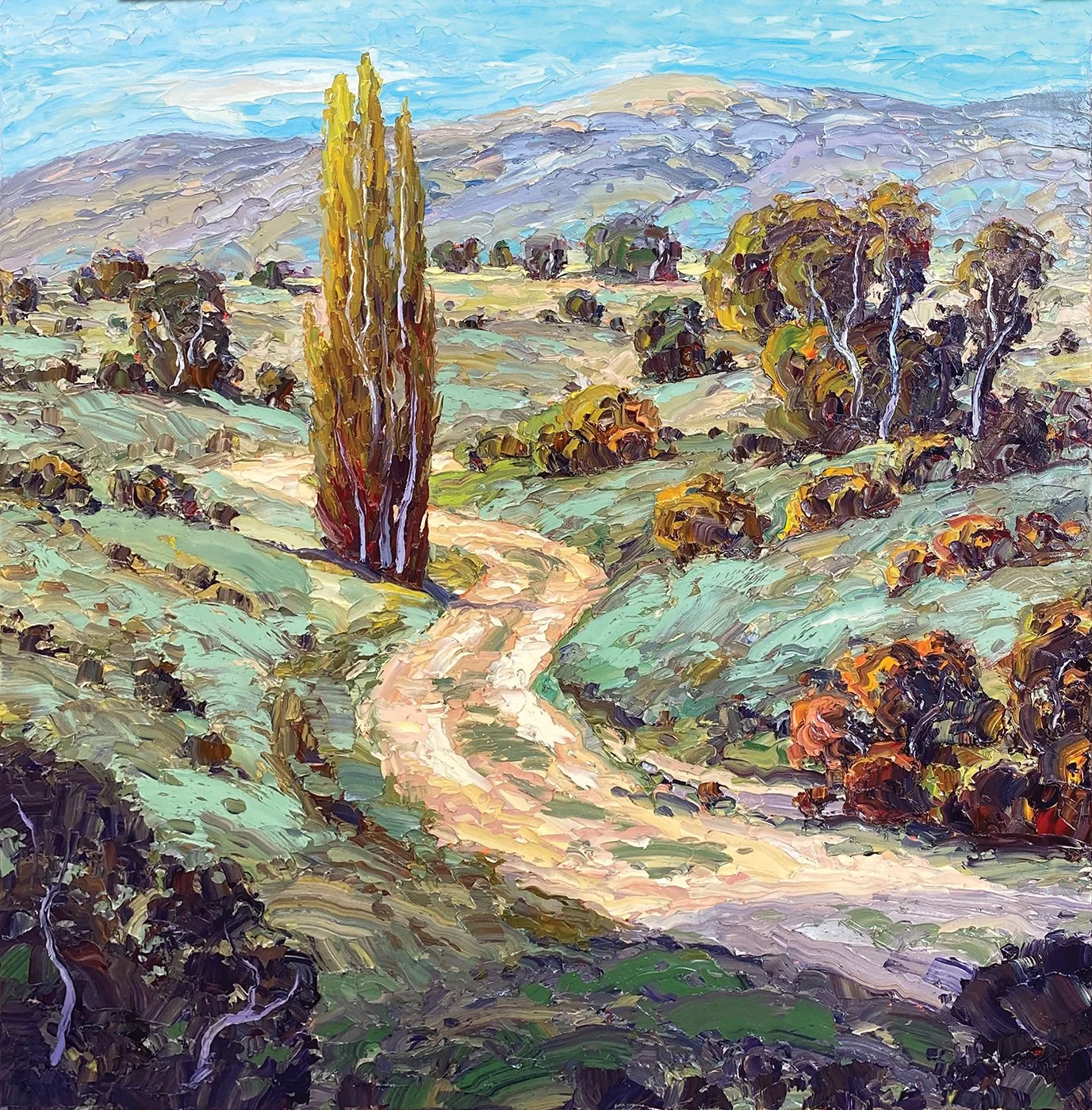
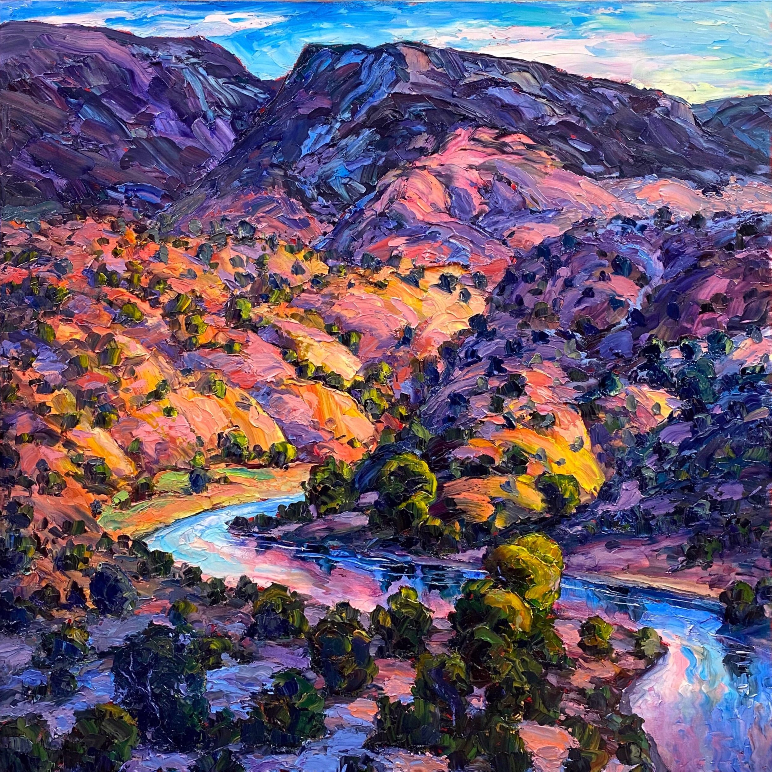
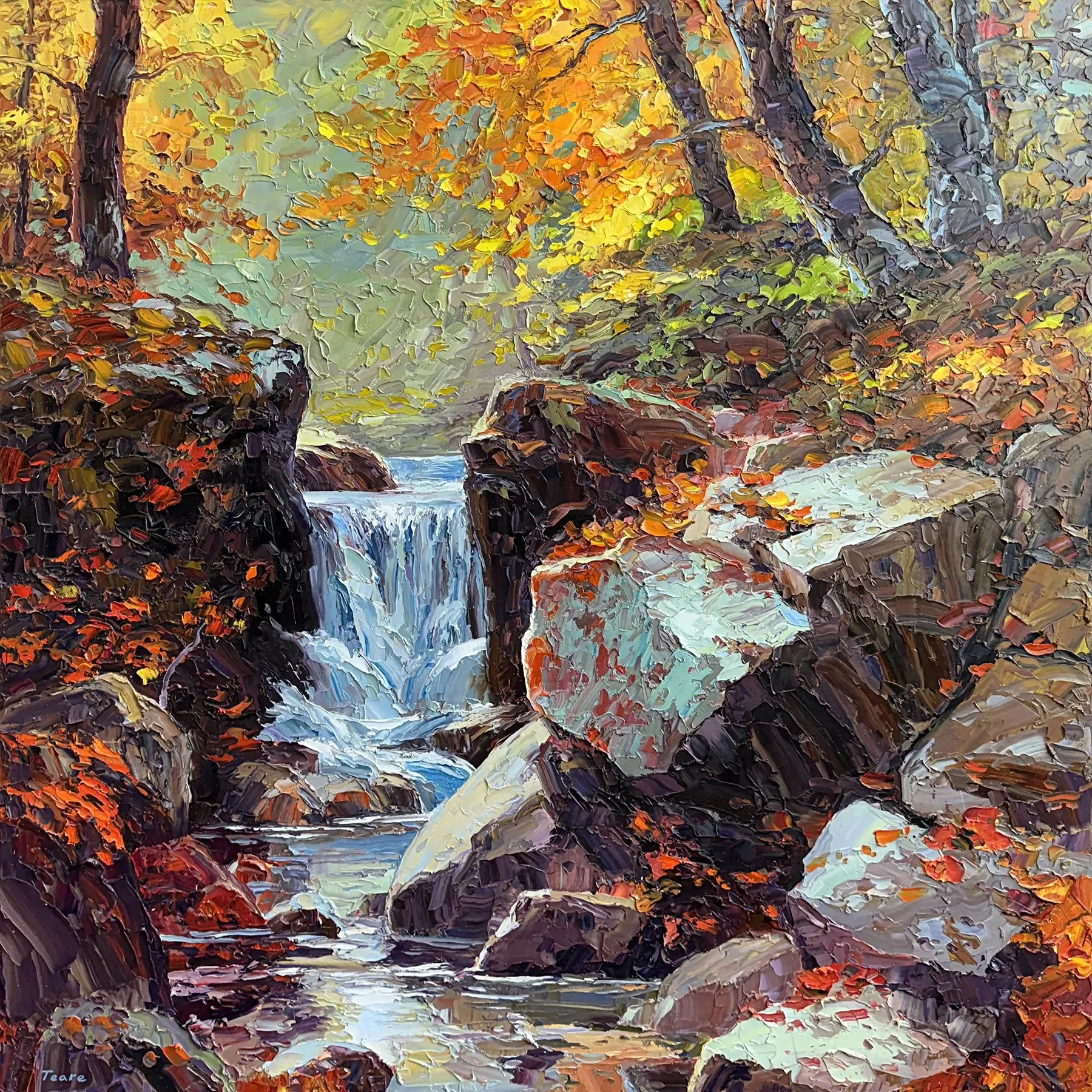
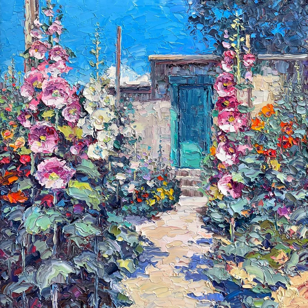
Click on the images above for a larger view.
Links
Brad Teare
Website: https://bradteare.com/
Instagram: https://www.instagram.com/bradteare/
Other Links
Maynard Dixon Home & Studio: https://thunderbirdfoundation.com/visit-the-maynard-dixon-home-and-studio/
Birger Sandzén: https://en.wikipedia.org/wiki/Birger_Sandz%C3%A9n
Rockwell Kent: https://en.wikipedia.org/wiki/Rockwell_Kent
Steven Heller: https://en.wikipedia.org/wiki/Steven_Heller_(design_writer)
Gustave Baumann: https://en.wikipedia.org/wiki/Gustave_Baumann
Maxfield Parrish: https://en.wikipedia.org/wiki/Maxfield_Parrish
Alan Magee: https://www.alanmageefilm.com/
Andrew Wyeth: https://en.wikipedia.org/wiki/Andrew_Wyeth
Wilson Hurley: https://www.wilson-hurley.com/
Eiteljorg Museum Quest for the West show: https://eiteljorg.org/quest-for-the-west/
Monet’s Grandes Décorations: https://www.musee-orangerie.fr/en/node/197502
Arlo Guthrie: https://en.wikipedia.org/wiki/Arlo_Guthrie
Neil Young: https://en.wikipedia.org/wiki/Neil_Young
Bob Dylan: https://en.wikipedia.org/wiki/Bob_Dylan
Miles Davis: https://en.wikipedia.org/wiki/Miles_Davis
Eddie Offord: https://en.wikipedia.org/wiki/Eddy_Offord
Booth Western Art Museum: https://boothmuseum.org/
Thomas Moran: https://en.wikipedia.org/wiki/Thomas_Moran
Available on:
Apple Podcasts
Amazon Music
Spotify
YouTube
Transcript
A Note About This Transcript
This transcript has been edited for clarity. I’ve endeavored to capture the thoughts and expressions of my guest as accurately and truthfully as possible. In some cases this means completing incomplete thoughts, removing stammers and word fillers such as um, like, you know, and so forth. I’ve edited the transcript to make it easier to read. Please pardon the inevitable errors that I may have made or overlooked.
Carl Olson: You've been traveling. So where were you?
Brad Teare: I was down in Mount Carmel at the Maynard Dixon studio.
Carl Olson: What was that like?
Brad Teare: You know, it was really cool. I'd been there twenty one years ago. I can hardly believe that. I stayed in the bunkhouse, and this time they hosted me in Maynard Dixon's cabin. It was great! It was kind of magical in a way.
Carl Olson: Is it still furnished the way it was?
Brad Teare: Yeah. His hats are up on the wall. And, all his books are up on the bookshelves.
Carl Olson: Did you look at any of his books, or, wear his hats? [chuckling]
Brad Teare: Hey, I thought, I could take that hat out on site and wear it and take some pictures. But, his head's a lot smaller than my head. I'm a little embarrassed to say I did try to wear one of his hats, but...
Carl Olson: [laughing] I’m proud of you! I would have done it, too!
Brad Teare: He had some cool hats, I gotta say.
Carl Olson: So he did. And, he was an amazing artist.
Brad Teare: Yeah, he really was. I'm tempted to say he was underrated, but at this point people do appreciate his work. They also have reproductions in Dixon's cabin. In the bathroom they had one of his drawings. The guy was an amazing draftsman. I mean, he just had so much energy in his drawings, which I'm always in awe of. I really find that incredible.
Carl Olson: Did you find that being there in his cabin during this residency that it had a profound effect on how you might view your art making going forward?
Brad Teare: You know, I haven't really processed the experience as yet, except to know that there was something sort of transformative about it. I'm not sure. At one point I went down just south of his studio. There's a naturally occurring tunnel that the water has eaten through. It looks like really soft rock – it could even be chalk – but it's a massive tunnel. I walked through that thing and it had some kind of metaphorical power over me. It was quite interesting. Anyhow, I’m still processing, you know.
Carl Olson: Did you do outdoor painting while you were there?
Brad Teare: Yeah, that was the primary reason I went down. I brought all my plein air gear. And, I spent most of the day painting every day.
Carl Olson: Oh, that must have been fun.
Brad Teare: Yeah, yeah, it really was fun. I got dehydrated towards the end. For some reason, I didn't know what was going on, and I thought that it was the weirdest thing. I mean, everybody in Utah knows you need to drink a lot of water when you're out hiking or whatever, but I was just slowly getting more and more dehydrated towards the end and we're wondering what's going on? I was hauling fifty pounds worth of painting gear up and down the foothills, around his studio and it really took the stuffing out of me!
Carl Olson: Some folks that I know that are really good outdoor painters have told me that they are slowing down. They go do outdoor painting with purpose. It's not to create necessarily a finished work. But it's a bit of therapy to go out into the field and see things.
Brad Teare: Yeah. My plein air painting was very different from the last time I went out. I have to admit this summer I haven't been doing a lot of outdoor painting.
Probably about two or three months ago, I wrote an article and it was really an exploration. I was trying to find my reason for outdoor painting because I was thumbing through all my plein air sketches and I was thinking – you know, I could be so much better at plein air painting. What am I trying to do? Why do I even do it? And so I wrote this article and it's actually going to be published in Plein Air magazine this September. Writing the article kind of reset my reason for painting outside. I love to have a good painting. Who doesn't? But I just set aside all those considerations of trying to paint an amazing painting and just really focus on trying to absorb the spirit of the landscape. It was really helpful. I actually got some pretty nice sketches. In fact, Susan Bingham, the director of the Thunderbird Foundation, said she wanted a couple of them. So I'll probably frame them up.
Carl Olson: Well, that's nice. I would be hard pressed to let go of my outdoor paintings because they're my study notes, my journal, as it were.
Brad Teare: That's true. There's some truth to that. You know, I had a superstition that if I gave away a painting or let a painting go, sold it, that somehow it would magnify. There was some kind of return back to me. I know it's just totally nonsensical, but, it’s like wearing a pair of lucky socks. It kind of worked. So the name of the article that's coming out is called It's Not the Mountain. And the title means that I am not a camera. I don't take pictures of mountains. I'm after something else.
“It’s not the mountain. I am not a camera. I don’t take pictures of mountains. I’m after something else.”
Carl Olson: What is that?
Brad Teare: I am really fascinated with the marbling color idea, and it's a basic idea of impressionism getting that vibrational oppositional color thing going. That's really important in my project. I can't fully understand exactly why that is so fascinating to me, except the fact that it makes really amazing color, right? There's a kind of magic there. By magic I mean that it's an optical effect that doesn't exist in reality. So it is kind of a magical effect. I mean, it's super mundane. It's above the mundane, just like the sky is blue. I look at the sky and try to suss out what vibrational colors there might be. There might be some aqua, there might be some pink, you know, and you try to put that into the the strokes.
So that's a big part of my project. I'm looking into the shadows, especially when I'm painting outside trying to get that vibrational color in the shadow and really getting that energized. When you get a nice combination – there's all kinds of formulas you see stuff online on how to mix a shadow and all this stuff. But when you get that unexpected color, that's just right. That's really cool. And of course, that's why you'd want to keep your plein air sketches so you have a record of all those really cool little strokes in the shadows.
But then, if you give it away, it'll come back to you tenfold. So that's good, too.
Carl Olson: Well, cast your bread upon the waters and it'll return to you, right?
You used the term marbling or marbled color. And to me that's similar to broken color.
Brad Teare: It's exactly the same. When you're reading people talk about broken color. I just switched over to marbled color. I like the metaphor just a little bit better. It’s a more powerful visual idea for me. Marbling versus broken. Of course, it's just semantics really.
Carl Olson: Well, words are important in describing what we do. With broken color I think of the Impressionists and how they would have individual brush strokes next to each other, each a different color. That creates a vibration. Each one has its own effect.
Brad Teare: Exactly! Early in my career, I went to see some of the early French Impressionists paintings. That's one reason I shifted over to alla prima. I love the freshness of alla prima strokes. I could see that some of the early French Impressionists had a stroke that was a little bit more brittle so broken color was kind of very descriptive of what they were doing.
There were these brittle straws of color kind of sprinkled over the top a dried surface. I'm not criticizing that technique at all. I mean, they're amazing. And of course, they pioneered the whole field. So a lot of credit there. But to me, I really like that fresh, juicy stroke of all the colors blended together. So marbling seems to really describe that.
Carl Olson: I think the Impressionists really opened the door to actually enjoying a painting. Before that the paintings were fantastic. I think of Thomas Moran and Albert Bierstadt here in this country, Thomas Cole, and the Tonalists. They were painting something that had emotional impact. But they were also illustrators of the Great American West, as it were. So it had an illustrative side to it. Nothing wrong with that, I like that. But the Impressionist came along and said, you know what? You can enjoy a painting for the painting itself, the textures and the effect of the paints. And you can just paint what you want. And it became more accessible to people.
Brad Teare: Yeah. He’s considered a Post-Impressionist, but, Van Gogh was certainly about enjoying the texture of the paint. When you look at a painting that has a lot of rich texture in it, like Van Gogh, there's something about the texture, the raw, sculptural quality of the surface. And I haven't really sussed that out totally. Part of it seems to be that you want to touch it. And there's a part of us that wants to see with our hands like a child would want to. They pick up a watch or something and explore it with their hands. It’s part of what they consider to be seen or absorbing the object. So there's something about the texture that's also very engaging - to me at least.
And you're right - I think the Impressionists did spark that joy of paint. Some of the colors they were able to use were so much more joyous than the brown, bitumen, and all those colors the academics were using. And I was like, “Oh my gosh!” Put down some brown. Then you paint into the brown. And every color you put in gets brown. There’s no joy there.
Well, the Impressionists were a lot less concerned about value. They were more concerned about chroma and hue.
Carl Olson: Do you remember when you saw your first Van Gogh in person?
Brad Teare: I do, absolutely.
Carl Olson: Do you remember which painting it was and how you felt when you saw it?
Brad Teare: You're the first person to ask that. I don't remember the collection, but it was overwhelming. For one thing, it was one hundred and twenty pieces at the Metropolitan Museum. And in 1990, somewhere around there, or 1989, there was a huge show of his work. It just blew me away. I literally wept from some of Van Gogh’s paintings. It was just incredible! When I talk to some my fellow painters, they say that Van Gogh is not their favorite. They say he wasn't a good draftsman and his colors are muddy. Well, you have to see his paintings in person. I literally would stand in front of a painting I had in a book and not recognize it. And it would slowly dawn on me, “Oh, this I've seen! I've seen this in my book!” And I've had that experience with Rembrandts as well. Some artists - they just don't reproduce very well in print.
Carl Olson: That's so true. When I first saw an original - actually several original Van Gogh's at the High Museum of Art in Atlanta, it was a staggering moment to see his paintings that they had there. And it was it was extraordinary.
Brad Teare: Yeah. With my work, if you see it online or in print, you're only getting about fifty percent, maybe seventy percent of the impact at most because the rest of the thirty percent, fifty percent is in the structure of the paint. But, I view that as a good thing. In fact, I spent half of my artistic career as an illustrator - and there's a lot of debate among illustrators that our work was is fine art or not. At the end of the day, an illustration is made to be reproduced in print. And fine art isn't. When I paint a painting, I'm not really thinking, is this going to reproduce? Well, I almost find that the better the painting is and the more impact it has on me emotionally, the harder it is to photograph. There’s a certain ephemeral quality that you can't capture - and you don't want to capture it. It’s like capturing a beautiful bird or something, you know?
Carl Olson: To me post when you post a picture on Instagram of one of your paintings, it's like the movie trailer version. And then when you go to the gallery or a collector's home and see it in person – now you're seeing the feature film in full. And it's amazing!
Brad Teare: That's the power of a great piece of art.
Carl Olson: When started as an illustrator, were you working with physical mediums like gouache and that sort of thing, or were you working digitally? When were you working as an illustrator?
Brad Tear: We moved to New York in 1989. My career basically spanned from 1989 to 2000.
Carl Olson: So you were at the transition between the physical art and creating physical assets for reproduction, having the big cameras and all that, to digital.
Brad Teare: Yeah. Very much so. That was a transitionary phase that I was privileged to experience because – in a way – it was kind of the end of an era. The last of the really great art directors in New York. The whole tradition of classic illustration.
So as an illustrator, I actually did woodcuts. In fact, that's why I was invited to the Maynard Dixon studio. It was on the strength of my woodcuts. And I, while I was there, I did a series of woodcuts based on imagery from the Maynard Dixon studio and in in close vicinity of that area.
Carl Olson: And that's the first time you went...
Brad Teare: Yeah – way back! That's when I was kind of switching over to doing more woodcut landscapes. I did that probably for about five years to seven years.
Carl Olson: What was the draw for you to do that?
Brad Teare: I grew up in Kansas pre-internet so we didn't have a lot of access to what it meant to be an artist. I had a great-grandfather who was an artist and landscape painter, and we had some of his paintings in our house. So that was probably what gave me the idea I could be an artist because I always wanted to be an artist. I've never even understood where that came from exactly. It was so embedded in my early childhood. But the only artist I really had much exposure to was my great-grandfather and Birger Sandzén.
Carl Olson: Oh, man, I love Birger Sandzén’s work!
Brad Teare: He lived about thirty miles from where I was raised in Kansas and Lindsborg, Kansas. There was actually a painting in the lobby of my junior high by Sandzén. I could see this guy was a great artist. And that's cool. I didn't know he was famous. I don't know if he really was that famous at the time. I mean, if the painting was in the lobby of the junior high, probably that painting is now worth half a million dollars. You know what I mean?
Carl Olson: It might be.
Brad Teare: My neighbor had a woodcut by Sandzén, too. I didn't really connect the dots like realizing he was an amazing artist, but but I loved them! I just naturally loved them. Which is a good sign to appreciate someone without realizing how well regarded they are by the art community. That's cool.
There was a book and by Rockwell Kent and I just loved his pen and ink drawings. It was fascinating. I worked during the summer in downtown Manhattan, Kansas. I worked at a print shop. It was an old letterpress print shop. I just kind of got obsessed – intrigued with the whole printing process.
So when I was in college, my first year of marriage, this print shop was going out of business and they had an old proof press. It was really struggling. I studied illustration at Utah State. And here in this little valley I live in – I just had not connected with the style at all. So I went and I bought this press. I bought some wood engraving blocks, and I started doing wood engraving of all things because Rockwell Kent did wood engravings. I just had a knack for it. So right off the bat, I immediately was doing these pretty competent wood engravings and woodcuts. So my wife and I said, “Hey, we're good to go. Let's let's pack up the trailer and head to New York.”
And on the first day in the city, I got a job with the New York Times.
Carl Olson: The first day?
Brad Teare: Yeah. First day.
Carl Olson: That's pretty remarkable to me. I mean, when you went to New York, had you already applied? Or, did you apply that day you arrived? How did they see your work? How did you get hired?
Brad Teare: It's really funny because I was reviewing my portfolio with an illustrator friend that lived out near New York. I said I should go to the New York Times and show my stuff.
And he goes, “Well, I don't know. Don't shoot yourself in the foot on your first day. Just go and see some of these other publishers first.”
But I was in Times Square and it was a blistering hot day. I mean, if you've been in New York on a hot day, you know, it's hot.
Carl Olson: You're at sea level, one hundred percent humidity!
Brad Teare: So I was just sweltering and I looked down forty second Street and there was a New York Times sign. And I go, “I bet they've got air conditioning in their lobby. I'm gonna go down there.”
So I went down to the New York Times and walked in. I had a portfolio, of course, and I suppose I looked like an artist and so when I walked in the guy at the desk says, “You probably want to see an art director.”
And I go, “sure!”
So he's on the phone and the next thing I know, he's talking to Steve Heller, the legendary art director of the New York Times at the time. I knew who he was. I was like, “Holy cow! I'm going to be talking to Steve Heller!”
And so the guy at the reception desk directs me to go on up to the ninth floor. So I went up and showed my portfolio to Steve Heller. At the end of our conversation he said, “I’ve got a job for you.”
Carl Olson: Wow! So when they hired you – was that a full time job or freelancer?
Brad Teare: I was totally a freelancer. And later I worked for book publishers, magazines, and so forth.
Carl Olson: What a transition from doing woodcuts! I assume you still do the woodcuts?
Brad Teare: You know, I maybe do one a year. I’ve kind of drifted away from doing woodcuts a little bit. It just wasn't giving back. I really love color now. By and large my woodcuts were black and white. I used some color. My landscape woodcuts have a lot of color.
I don't know if you know, Gustav Baumann. I kind of borrowed his technique of the lost key method of woodcut. They have a more painterly kind of quality. And so I started to kind of have these painterly quality in woodcuts. And then finally I said, “Well, hey, let's just use paint.” So that was kind of the transition there.
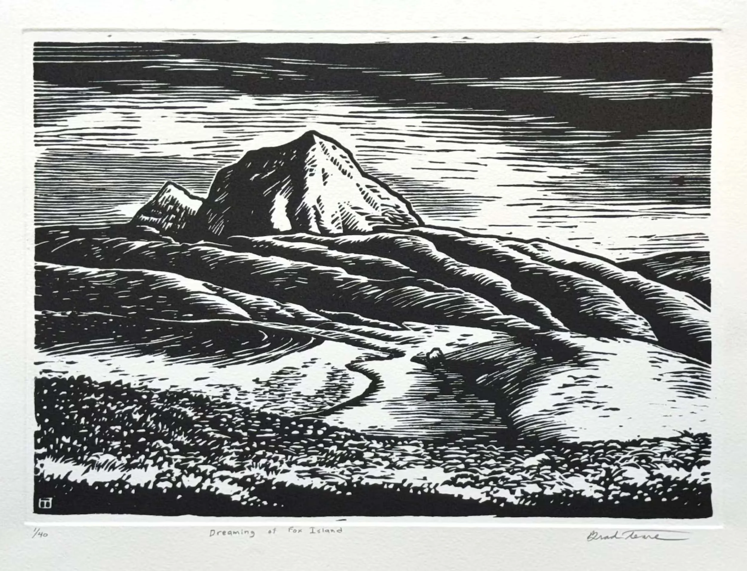
Dreaming of Fox Island | 12×8 in. | Woodcut | © Brad Teare
Carl Olson: Were there lessons that you took from doing the woodcuts that apply to what you do today?
Brad Teare: Yeah, absolutely. I actually floundered quite a bit – like for seven years when I was kind of phasing out of woodcut and phasing into painting. Some of my paintings done with brushes are pretty good. I mean, I look at them now and realize they’re not bad paintings. I could have maybe kept pursuing that and had a nice career with brush paintings. I don't know. But they looked like other people's paintings.
Then I actually had the weirdest opportunity to do an abstract show. It was odd.
Carl Olson: An abstract show?
Brad Teare: Yeah. You know, I had a bunch of I had a series of paintings that were little eight by eights and ten by tens on my mantelpiece. They were just like paintings of things like rock textures, the trunk of a tree, and that sort of thing. Just super close ups. I was trying to decode the rhythm of those textures.
A gallery director from one of my galleries came into the studio and she said, “Those would look really cool as abstracts.”
And I go, “Really?”
And she says, “Yeah. Why don't you do these four by four square, or three by three, and we'll have an abstract show.”
And I go, “All right! That sounds fun!”
So when I got into it, I discovered that I really couldn't get the paintings to dry in time for the show. She wanted it in six months.
Carl Olson: About when was this?
Brad Teare: Probably about 2006, or 2007.
I thought, well, I'm going to have to use acrylic because, they're not going to dry in time otherwise. So then I started using acrylic. Then I thought, I can't get enough paint on here with brushes. I'm going to switch over to palette knives and trowels. So I switched over to that and I just fell in love with palette knives and trowels and that form of mark making.
When the project was over the show did really well. It was amazing. I don't think of myself as an abstract painter, but the show sold really well. I thought then I'm going to paint my landscapes with palette knives. That was within months of making this switch over to using palette knives. I then had several major galleries approach me and say they wanted to carry my work.
When using a palette knife to make a stroke, it’s like carving into a block. I mean, metaphorically (and I’m into metaphors). I'm using knives instead of brushes, same as with woodcut, you know? So there was this kind of like carving out kind of a thing and it just felt right. It's the way my brain worked.
So, abstract painting didn't really stick. I don't think of myself as an abstract painter, but man, it was so formative to me. I mean, it was six months of just painting and abstraction That was like going to the best school I could have ever asked for.
Carl Olson: So what were some of the lessons from that school?
Brad Teare: I think it helped me to just let go. I was kind of obsessed with virtuosity as a painter with brushes. Some of my early influences weren't all that good. Sometimes we can have heroes that maybe have a bad effect on us.
“Sometimes we can have heroes that maybe have a bad effect on us.”
Carl Olson: Now that's interesting. I've never heard that before. What do you mean?
Brad Teare: Well, one of them – and I'm in no way dismissing his work – one of my early artistic heroes was Maxfield Parrish. And so I tried to emulate his work. I doubt if very many people could do his technique. I mean, I've tried to imitate it. It's almost impossible to get the effects he was getting. So he had some kind of magic – he had the magic touch. He invented that technique. That technique was specifically for him. So it was completely wrong for a student to try to co-opt that style? I wasted quite a bit of my student years trying to paint like him – doing the glazing and everything.
And, you know, I had a few other people who had a kind of a slowing effect on me for my career. At one point I was painting these large, very intimate landscapes on watercolor paper that I stretched on these big panels. I would spatter and do all kinds of scraping. And it was kind of like Andrew Wyeth a little bit. But I was kind of obsessed with that kind of level of detail at the time. And because I just admired his work so much, it just slowed me down. My brain is not built like that. I was never going to paint like that. I actually got really good at it and I could sell these paintings really well, but I could only do like two or three a year. So it wasn't going to work for me. And it drove me crazy! And then I met Alan Magee. I loved his style. I don't know if you know his work...
Carl Olson: I'm not familiar with him.
Brad Teare: He was he was a very popular and successful illustrator in the eighties. And I did some sci fi illustration stuff like that, but then transitioned into fine art and did a lot of trompe l'oeil and that sort of work later on with gouache and watercolor and very thin washes of acrylic – but extremely highly detailed. And Magee told me, “Find a technique that you can live with.” I interpreted that to mean is find a technique that really syncs with who you are. Don't, don't try to be somebody that you're not. It's not going to work for one thing and you're just going to frustrate yourself. So I shed all the presupposition of I'm going to be Maxfield Parrish, or, I'm going to be Andrew Wyeth. So now it’s just me in this paint. That's it.
Carl Olson: You finally decided to be Brad Teare.
Brad Teare: Yeah. We'll see what comes out the other end. I think that's one of the most harmful things artists can do: covet other people's styles. It's really a pointless exercise and ultimately destructive to both your work and to you personally.
“I think that’s one of the most harmful things artists can do: covet other people’s styles.”
Carl Olson: I think that's a good point. While I don't want to dissuade people from going to workshops – especially since they contribute to a lot of artists’ income – but what I found with myself personally was that I was learning how to paint like that artist. But, I didn't want to paint like that artist though I love their work. I did learn from them the needed foundations of painting such as values, colors, drawing, composition, perspective, and that kind of thing. But in the end, I just needed to be myself. And I was afraid that the more I was exposed to those things, that I would probably become more like them. Does that make sense? Maybe that's a mis-founded fear...
Brad Teare: No, I don't think it is. I think what art students need to learn: Every artist has to invent their own journey, their own path.
So if you read all the different art biographies and things about how different artists became who they are, and then you decide you’re going to follow that you may fool yourself into thinking you are successful. In business and other entrepreneurial fields, there's this idea that if you find somebody who's successful and do what they do and you'll be successful. That's true. Maybe in those fields. But, it's not true in art.
You've got to invent your own path. You've got to find your own way forward. I think there's two phases of an art journey. The preliminary phase where you're absorbing all the concepts. And that's absolutely legitimate. You should do master copies. That's how I learned that I wasn't a Maxfield Parrish. You learn a lot from the process. For example, I do glaze now – something I learned from Parrish.
“Every artist has to invent their own journey, their own path.”
Carl Olson: So you did take a practical lesson from Parrish, right?
Brad Teare: Yeah. I took a little pinch of what his magic was. I was trying to think.. did I take anything from Andrew Wyeth? Nothing pops out. But, his control of values is really cool. I hope I'm kind of getting a little bit of a handle on values, but...
Carl Olson: Well, you mentioned the splattering and the texture and the details that Wyeth used. I've seen his work up close in person and there is texture to his approach.
Brad Teare: Oh yeah. Absolutely.
Carl Olson: Yeah. I mean, when you look closely into the individual square inches of Wyeth’s painting, he's certainly done it, man. There's a lot of texture there! There's a lot of abstraction going on, even though his illustrations as a whole are very detailed.
Brad Teare: When I went to see Maxfield Parrish show at the Rockwell Museum, I was talking to my friend and I was staring really close to a painting and probably freaking out the guards.
Carl Olson: I've done that!
Brad Teare: [laughing] We all get yelled at. I almost got arrested at the Whitney.
So, I said to my friend who was with me at the exhibit, “Maxfield Parrish was a microscopic impressionist.” I just kind of blurted it out. As I thought about it, I felt that's a pretty apt description because he had this pointillistic, kind of microscopic, but not completely microscopic. Just on a very high resolution level he had all these dots. He would take paper and he would squish into it colors and then put it on the board to get these weird textures.
So I think you're right. I think texture is something that I'm really obsessed with. And both those guys were totally into texture. So, you do borrow in a way from from them, but you've got to transform it into something that's yours.
“I think texture is something that I’m really obsessed with.”
Carl Olson: So we've been talking about your prior foundations for the way you paint today. I want to explore this a little more.
In Western Art and Architecture magazine [June/July 2026] is this incredible painting you did. I want to see that in person. Where could I see it?
Brad Teare: That one is going to Legacy in Scottsdale, Arizona.
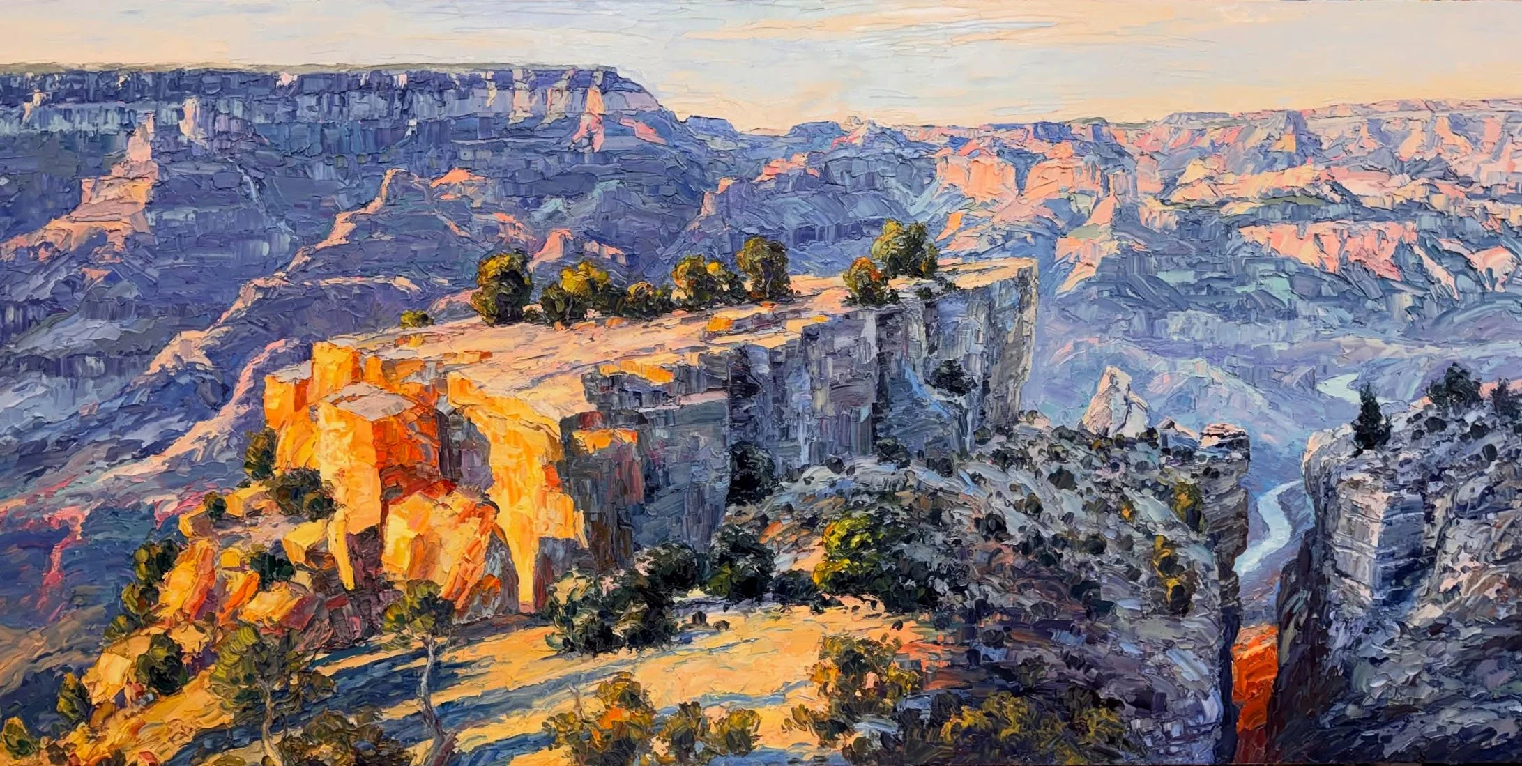
Shadow and Light | 48 × 96 in. | Oil | © Brad Teare
Carl Olson: It's a beautiful painting. And I bet it's ten times better in person.
Brad Teare: There's a lot of firepower in that baby.
Carl Olson: You know what draws my eye to it? So I'm looking at this and I see a spot of sunlight in the crevice of the rocks in lower right hand corner of the painting. And then there's the Colorado River just above that crevice. It looks tiny but it’s a 300 foot wide river. The way you captured that narrow band of river is just awesome.
Brad Teare: Thanks! That's the apex of my painting ability. That painting was a joy to paint. That thing is four feet by eight feet.
Carl Olson: I've never done one that big.
Brad Teare: I hadn't either. That's the first.
Carl Olson: What was it like?
Brad Teare: It was a joy. One of my early influences was Wilson Hurley.
Carl Olson: I love Wilson Hurley's work.
Brad Teare: He has a mural at the museum, and I go to the Quest for the West every year. So I got to see that thing in person, and it just blew me away. I mean, it's just incredible, you know?
Carl Olson: Hurley is not known for using heavy texture in his paintings, but it is amazing to see his work and the sheer scale of his paintings. It's unbelievable.
Brad Teare: I hadn't really seen a lot of his work lately. Of course, he passed away a decade ago or so. It was really great to see his work. It’s just such magnificent work. Hurley said painting big really energized him. So when he stretched a big canvas, he just felt the energy come into the studio. And I got to say, I felt the same thing. I have done three large paintings now and I've loved all three of them. I'm going, well, I hope these babies can sell, or my studio is going to be filling up here pretty quick!
Carl Olson: I think of Monet doing the what he called The Grand Decoration – huge panoramas of his water lilies. I've never seen it, but I would love to see that.
Brad Teare: I know I want to go.
Carl Olson: Because you would be totally immersed in these huge paintings, right?
Brad Teare: Yeah.
Carl Olson: So back to your painting, is that on board or canvas? I imagine at that size it would probably be on canvas.
Brad Teare: You get that big, they just get too heavy on a board. And I do prefer canvas.
Carl Olson: Why is that?
Brad Teare: When I do a painting on a board, I use cold wax when I do that. There's something about cold wax. It kind of like refreshes my thinking or clears my visual palette or something. It's a really tactile experience for me. I really enjoy using the cold wax. Of course, you have to use a panel with cold wax or it'll crack. I get a different mark with the panel. On the other hand, stretched canvas gives me the ability to to get a smoother transition. It gets smoother, a softer edge or a harder edge. I have more control that way. I tend to just get hard edges when I'm on a panel. On a canvas there's this kind of really gentle give, and I find it just lovely. I'm very much into the tactile quality of putting on paint. I'm really sensitive to the consistency of the paint.
Carl Olson: What draws you to paint with thick texture? What is the appeal to you in doing that?
Brad Teare: It's twofold. One is just the kind of the visceral impact of it. Like when I went to the Van Gogh exhibit and saw the texture that he put in. I mean, sometimes he would squeeze the paint right out of the tube and you could you could see it on the canvas. It was just like a line of paint, you know? I mean, there's something just really, really visceral, something really kind of savage, sort of primal about it. It’s not a complete rejection of virtuosity, but a disregard for virtuosity. I know that sounds kind of presumptuous. But I think when we get obsessed with virtuosity – something goes out the window. I'm not sure what it is.
Carl Olson: So when you say virtuosity, what do you mean? Are you talking about the movement or the performance?
Brad Teare: No. The performance and movement is cool. That's kind of the rhythm of the act of painting. But I think it's an obsession with more than technique. It's like the Olympics. You're trying to convert the process into an Olympic performance. People can jump at 20 feet. And, I'm going to jump 21 feet. The last painter did 22 feet. And now I'm going to do 23 feet. It's not a competition per se, but there's an element of that, and you have to unfetter yourself from that you're going to drown. Speaking for myself, I enjoy a really virtuoso painting. I mean, they can trigger certain moments of joy in me as well. But, for me personally, it's like a quagmire of some kind. As you can tell, I'm struggling here to articulate exactly what I mean.
Carl Olson: It sounds like... let me see if I can zero in. I don't know that I can.
Brad Teare: Let's try.
Carl Olson: So as I'm sitting here listening to you talking about virtuosity and I think, what's a good parallel? Perhaps a musician who is really good. You might call him a virtuoso. And why is that? It's not just his performance, but it's all the things that he has learned before. It’s the way he expresses himself as he plays. It’s the way he bends the string on his guitar, or, invokes vibrato on his violin. Those are specifically his his techniques, his ability to express in his own voice.
Well, I don't know if that makes any sense.
Brad Teare: I think you've latched on to a really good metaphor there. In music, I would say virtuosity – as I'm kind of loosely defining it here – would be analogous to an overproduced album. On the other hand, when you have a live performance it includes all the little imperfections of a live performance. There's this kind of energy there.
Carl Olson: So Beyonce versus Arlo Guthrie.
Brad Teare: Yeah. There's something kind of primitive about those kind of live performances where they just kind of let things go.
Arlo Guthrie's a pretty good example, or, Neil Young or Bob Dylan – those sort of musicians. I didn't really understand them until I got to a certain point. When I started to understand jazz a little bit better, like Miles Davis and what he was trying to do – I started to see that they are trying to bring in the vitality. They're trying to bring in that life. Sometimes you get a producer like Eddy Offord or somebody like that, who can produce the life out of a performance. So that's what I'm kind of labeling right now, virtuosity [a too perfect performance]. There's this obsession with the perfectionism. I'm trying to introduce or allow more of a wabi-sabi kind of a idea back into my work.
And that is the idea of being perfectly imperfect.
Carl Olson: Perfectly imperfect?
Brad Teare: Yeah.
Carl Olson: That's an interesting concept.
Brad Teare: I actually got this from woodcut because – let's say I'm cutting a woodcut. Let's say I have the sky and in the sky there's just like a couple of clouds or something. If I clear out all of the wood out of that so it just prints blank, white – well, how energetic is that? How interesting is that? It's not.
So you leave all these little imperfections in the corners of the woodcut and around the objects. So it has these little linear marks – my wife and I used to call them tick marks. I don't know what they what the real word is, but there's this kind of electric little marks around a woodcut. You might go, “Well that's kind of sloppy.” Is that really good craftsmanship to leave all those little marks and little chunks. Well, if I clear it out, all the life's gone! All the energy is gone!
So that's the kind of idea that I tried to infuse back into my painting – that kind of imperfection. When you look at my paintings up close, you go, “Man! There's a lot of sloppy painting here! I can clearly see he mixed up three colors on the palette, took one swipe, was probably not even looking at the canvas and he just left it!”
Carl Olson: Of course, there's more to it than that, right?
Brad Teare: I was actually filming myself once, and I actually did see myself put on a stroke when I didn't even look. It was totally by my feel. I knew where that stroke was going and I was mixing the next color in my mind, you know.
Carl Olson: Well, when you see a guitarist play a beautiful solo, his eyes are closed sometimes.
Brad Teare: Yeah, I know where the canvas is. I know what the colors are on my palette.
Carl Olson: Well, bottom line, it was fun to do.
Brad Teare: Right! You kind of let go.
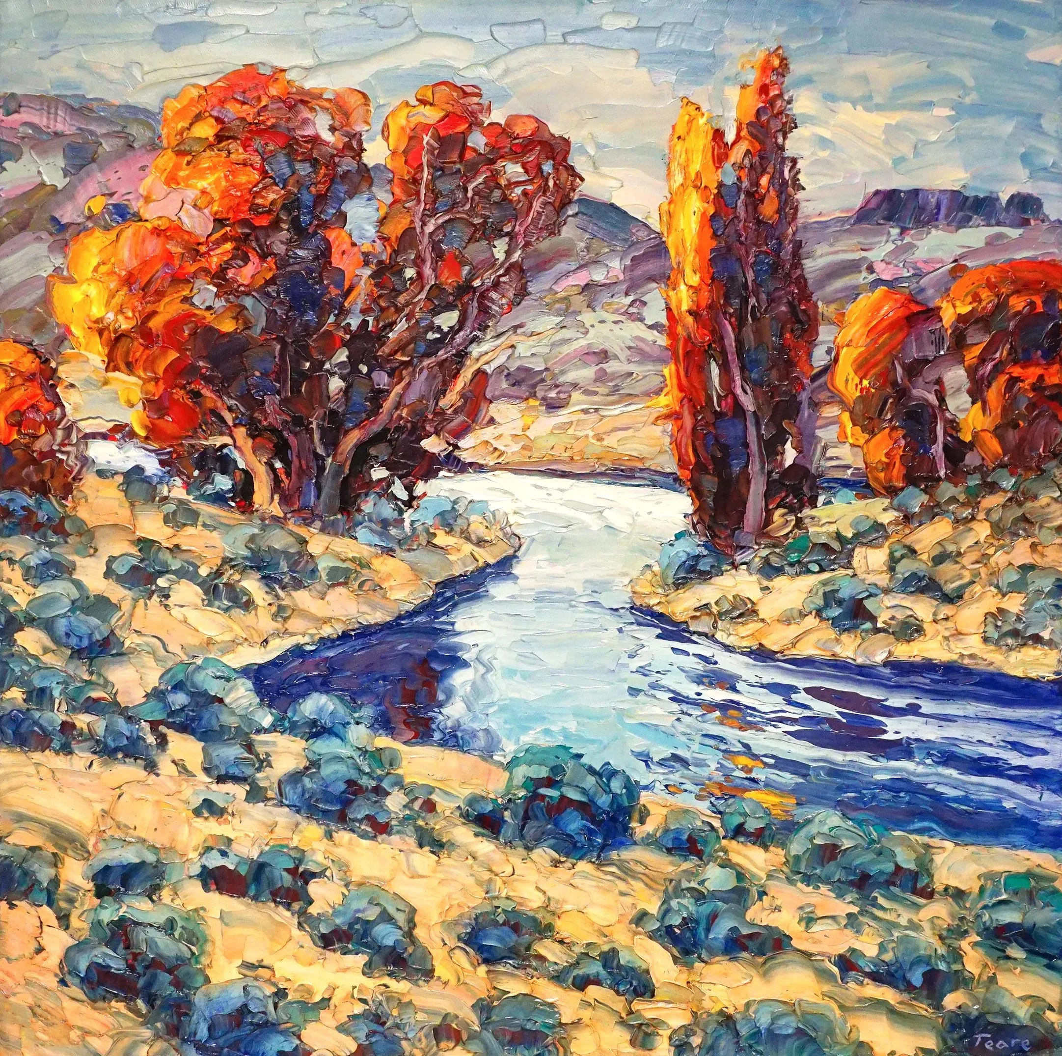
Desert Pilgrimage | 24 × 24 in. | Oil | © Brad Teare. This painting is an excellent example of how Brad Teare use thick paint. It’s perfectly imperfect!
Carl Olson: Sometimes we equate perfection with precision. If you have a perfect motor in a car, it would never break down. Right? But there's another aspect of perfection that I don't hear people talk about a lot. Another definition of perfection is: something meets its purpose.
Art needs a bit of randomness. It needs that personal touch. Otherwise it would be a photograph or it would be just this impersonal rendering that doesn't touch the heart. It’s too perfect. Your paintings are perfect in the sense that they satisfy that need for the randomness, the the emotion, the energy, and the vibrancy that comes through. It satisfies a viewer's need for that.
Brad Teare: Right. I mean, you could almost say that an artist gets to create the formula by which he or she makes their art.
“An artist gets to create the formula by which he or she makes their art.”
Carl Olson: I love that!
Brad Teare: And you get to follow that formula to your heart's content without regard to the work of other artists. That allows for all kinds of art. Some people's personalities are very punctilious – they're very much into detail and that sort of thing. And then there are some who are totally different. I really do believe in a wide spectrum of different kinds of art. I do enjoy a lot of different kinds of art.
Carl Olson: Me, too!
Brad Teare: The trap, or flaw, would be when an artist, goes to a show and love an artist’s work so much that they think, “I wish I could paint like him!” It's totally contrary to your personality. And that's just so wrong!
Carl Olson: Well, we've been talking about texture from the standpoint of an artist, mostly. You made an interesting comment in one of your newsletters. I wrote it down. You said that “texture is one of the strangest tools an artist has, because it works on the viewer, even when they can't explain why.” That is fascinating to me. Let's talk about the effect on the collector, the viewer of your painting. What effect does texture have on them? Why is it so compelling?
Brad Teare: One thing is that it's a record when you see the texture. I mean, it's a stroke by you. The artist made that stroke. You mix that color, put it on. So it's a record of how we built it. You can actually see this kind of layering, this kind of interweaving of colors. And, you could almost track down exactly how and in what order I put down the paint because they overlap and finally build up to the ultimate impasto.
Carl Olson: You see the archaeology of it.
Brad Teare: Yeah. So there's this sense that you're actually witnessing a record of an event. That certainly is one aspect. I believe when I wrote that newsletter, I was really kind of burrowing down into what is it about texture. I was really trying to uncover what that was. But, maybe ultimately, largely, it's kind of a mystery. I think there is that kind of tactile thing, like you want to touch it. People say they want to touch it. I actually had one woman say she wanted to lick the paint!
Carl Olson: [laughing] Okay, I draw the line right there. You can't lick my paintings!
Brad Teare: No, that's not allowed! [grinning] At the Whitney you're going to end up in handcuffs!
People do have these terms they use to describe your art. Sometimes they use musical terms, and sometimes they use culinary terms. For example, they may say the paint looks delicious. So you're kind of tapping into a full spectrum of emotional responses. Like the touch, taste, the mouthfeel, or whatever it is. So there's this kind of spectrum. If you can evoke as many emotional notes as possible, you get a richer experience.
There's another quality to textured paint. I was talking with a fellow artist back around 2000, and both of us were kind of making the shift out of illustration at the time. We were sort of prognosticating on what the future might hold. It was turn of the century and so people love to make predictions. We were kind of falling into that. We decided that art that did not have a handmade quality was going to fall to the wayside.
If you have an art form that is totally pristine, you are going wonder: was this done on a computer or was this done by a human being? Those art forms were going to be less valued. So there was going to be an emphasis on the handmade, the tactile, this kind of wabi-sabi aesthetic. And I think largely that's proven true. I mean, perhaps not to the degree we anticipated, but I think I there's something about when you walk into a gallery. I frame my paintings so that they're in floater frames so you can see around the edge of the canvas. You can see the thick paint hanging off the edge. I want people to know that it is an object. I don't want them to think it's just some abstract form or something. I want them to know that it was an object that was created by a human being. I think there is an element of that.
Obviously there are things that are printed, reproduced in different methods. I mean, they're obviously made by a human being. I mean, a robot didn't run the printing press, but, it's somewhat removed. The less removed you can be, the more impact that art can have. So, when I talk to young artists, make art by hand so that you can see the mark, the fingerprint of the artist. We want to see that.
Carl Olson: Isn't it amazing when you see evidence of the artist’s hand in a painting like finding a brush hair that accidentally left the ferrule of a brush embedded in the painting. The artist missed it, but it's there and you see it. Oh, wow, I just love that!
Brad Teare: I just discovered as I was wrapping up a painting to ship and I discovered a chunk of canvas that was about as big as my thumbnail that had not been covered. And, you could see some of the drawing underneath. I'd used a graphite pencil to kind of sketch the outlines, and my first instinct was, oh, I need to cover that. You know, I do leave little chunks of red showing through, but I normally don't like to show that much and have a little bit of the drawing showing through. It seems kind of sloppy. It's like poor craftsmanship or something. But then I thought, no. It was one of the bigger paintings. So I decide to leave that. That's the mark. That's my mark.
Carl Olson: That mark is the true certificate of authenticity.
Brad Teare: Yeah.
Carl Olson: What kind of feedback have you gotten from your collectors that they've given you about why they bought the piece or how the piece makes them feel or how?
Brad Teare:: Previously in my early career, I didn't really enjoy going to shows that much because I didn't know what to say to collectors and that sort of thing. They're obviously reacting positively because that's why they're there. They want to see your work.
But when you're when you're asking that question, I share this with a little bit of reservation, but also a little bit of awe and deep, deep, profound appreciation. I've had this experience of people coming to my shows and they'll be ten, fifteen feet back and they'll just be crying. They'll be looking at my work and they're just crying. And generally speaking, I give them a little bit of time - I don't want to intrude, but I generally will go and ask them, “What are you feeling?” The things they say are just so beautiful that it really outstrips anything that I ever anticipated as an artist that people would say about my work.
Carl Olson: Was there any one experience that you remember that you're willing to share that illustrates that?
Brad Teare: I could tell this woman was struggling to articulate what she was feeling when I asked her the question. She said that this is what heaven looks like.
Carl Olson: Wow!
Brad Teare: It just kind of almost broke me up, you know? I can't say at that particular show that I was thinking about heaven when I painted those paintings, but it was a very beautiful expression to me. I've had that reaction quite a few times. And people will weep in front of my paintings. It’s very, very profoundly touching.
Carl Olson: That is amazing. It leaves me speechless. Well, I appreciate you sharing that, that very emotional response. It's just a beautiful thing to see that art can move people in a profound way.
Brad Teare: Absolutely.
Carl Olson: What's coming up next for you that you're excited about?
Brad Teare: I have the Quest of the West show in September, and that's always a super big deal for me. I take that very seriously and I love it. They treat us really good out there and I've had a sold-out show every year I've been there. So it’s always super successful for me and energizing.
Carl Olson: That's exciting.
Brad Teare: Last year the director of the Booth Museum bought one of my paintings for their permanent exhibit. I'd like to get out there especially since they bought a painting. I thought, “Hey, this has got to be a precursor to an invitation to their fundraiser.” I'm so I'm waiting by the mailbox for that [laughs]. But as for other stuff I've got going... I've got a few kind of pop up shows. I don't have any any solo shows coming up or anything at the moment. But in addition to the shows, just getting out and going to the National Parks – painting, painting.
Carl Olson: And avoiding the forest fires.
Brad Teare: That's unfortunate. Last year, we had a really good year. No forest fires. I was hoping for the same this year.
Anyhow, I'm looking forward to doing some larger paintings like the one of the Grand Canyon you showed. I agree with you that you have that hierarchy of viewing and you go on this visual journey. I really love that about a painting. And it's got to be subtle. You don't want it to be heavy handed.
But I would like to go to the National Parks and do that sort of hierarchical painting with every park. And certainly in Utah and in the West. We'll see because that was really a unique moment for me. I went to the park and I was painting there, and a park ranger came up with a bunch of kids and parents, and he was interpreting the landscape. I was at Moran Point and he was explaining how Thomas Moran did this fusion of of imagery from different parts of the canyon. They actually have a reproduction of one of his paintings there. And the park ranger was saying that this peak here was over there, and Moran kind of just fused them all together. It was kind of an eye opening moment for me to hear him explain this while I was painting. And the sun was going down – it was a beautiful moment where I was absorbing this wisdom of of Thomas Moran. It's pretty cool.
Carl Olson: It's really neat to stand at the different points where you imagined that he painted in Yellowstone and some of the other National Parks. That's what I like about living here [in Colorado]. I used to want to paint the iconic. But now I want to do something that's, um, okay, you might recognize it, but then you might not. I want to paint what I discover as I explore the southwest. I get in my car and I just drive and I see something. Oh, here's a little canyon here. Let me go explore that canyon.
Brad Teare: Yeah. Now, I shift back and forth. I recently did a little farm scene that's over the border in Idaho from where I live. It's just a gorgeous little farm scene. And, you know, nobody knows where it is. I don't want to move away from that. I don't want to do only Moran point kind of stuff. But occasionally I want to do a couple a year at least.
Carl Olson: Of course. The way I worded it made it sound like that was the wrong thing to do. But that's not what I meant. I think those are gorgeous paintings and I love them.
Brad Teare: Well, my roots really are in the little valley where I live. It is very rural or used to be. It's getting overdeveloped, but those are my roots – those kind of ranch scenes. I did a little plein air over near Crested Butte. I saw this little scrawny tree reflected in this kind of a ditch along the road and it was just gorgeous. I was painting all these scenes in Crested Butte – all these mountains and everything, which are gorgeous. But then I knocked out this little, intimate scene. You know, I don't want to lose that. I want to keep one foot in that that door because they're just so poetic. It's so evocative of the West. You could just feel the West in that little tree.
Carl Olson: Those are the kind of things that that appeal to me.
Brad Teare: And it's sort of like some of the most beautiful poetry that say very little. I mean, there's very few words, but assembled in the right way, just have this incredible punch – emotional impact.
Carl Olson: Brad, there is so much more we could talk about. But we’ll haver to end it there and save it for another day. Thank you for being on The Artful Painter today.
Brad Teare: It's been my pleasure. I really enjoyed it. It was a good conversation.
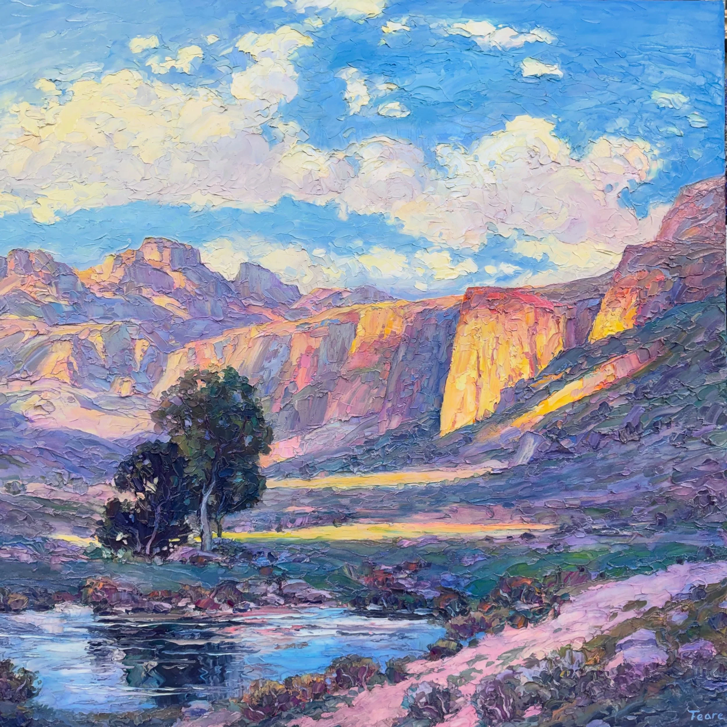
Desert Air | 40 × 40 in. | Oil | © Brad Teare