Chapter XVIII.
Balance of Colour
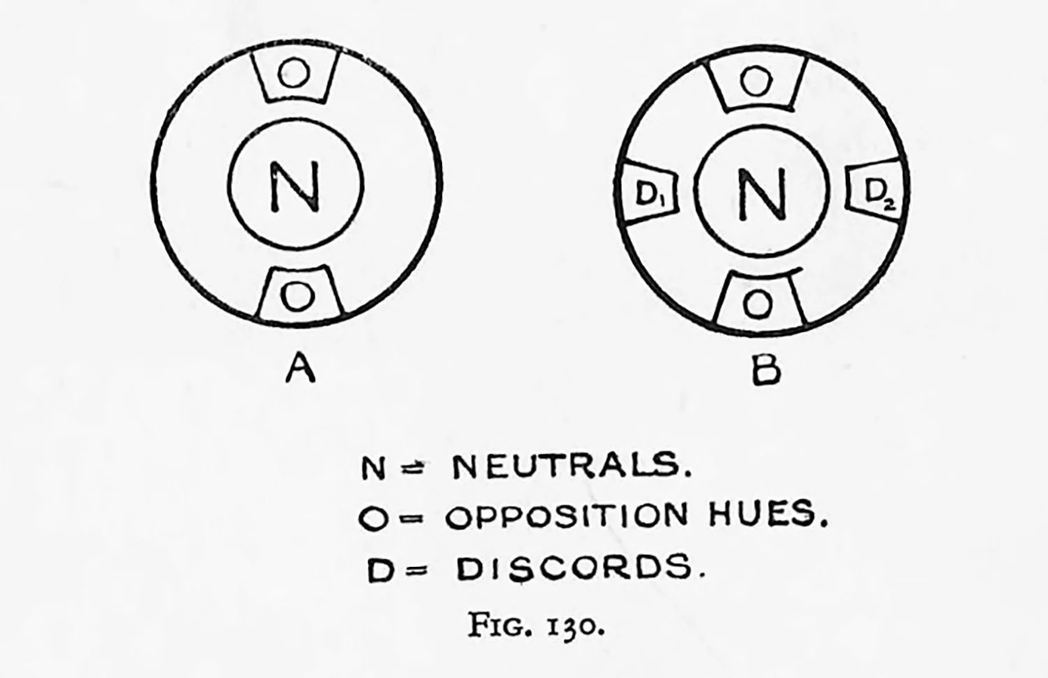
THE second colour-possibility may be defined as “opposite hues balanced against a neutral.” The word “balanced,” used in this connection, means “equal quantities of Opposite hues, or their equivalent.” Informal designs should possess unequal areas with the necessary unequal saturations. Formal designs may use equal areas and equal saturations.
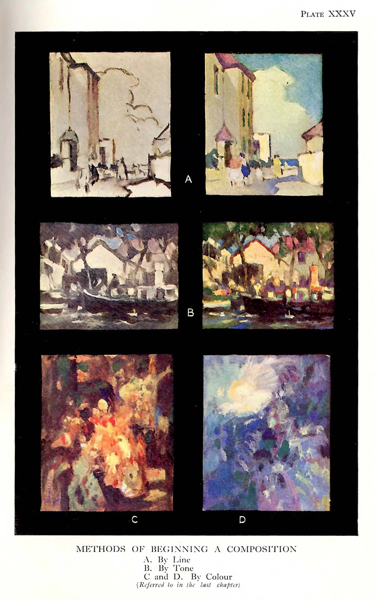
Adjacent hues on both sides of the opposite hues give variety, but care must be taken that the sense of opposition is not lost. A diagrammatic arrangement is given if Fig. 130, A, with several examples of its pictorial application on Plate XXXIII.
It must be understood in the first colour-possibility given in the previous chapter the neutrals and complementary tend to give predominance to a hue. Such qualifying factors form an antidoe, their object being to prevent a cloying sensation. In consequence they give quality.
In the second colour-possibility hues cancel out by reason of the quantity and equality of theit opposition, for the hues, no longer having any bias, give predominance to the neutrals. Even when the hues cancel out in the manner suggested, the neutrals requite sufficient form-content with appropriate distribution before they acquire quality. When these conditions ate given, the white cloud, the grey cloak, the black velvet dress, or any other neuttal objects, acquire their maximum importance as neutrals.
The scheme does not necessarily demand a neutral space, for it is possible for the neutrals to weave themselves all through a composition. Such a departure from the original intention is something in the nature of a compromise, of a concession to tone. The acceptance of neutrals as the dominant idea of a colout-arrangement is rarer than those schemes where hues are the chief colour-interest, although a great number of delightful examples are given by Turner, Whistler, and many of the Japanese colour printers.