Chapter XVII.
Harmony of Colour
WHEN relative saturation is understood and taken for granted, our further inquiries should undertake to grasp the two different colour possibilities. Let the simplest be taken first.
It might be defined as “‘a colour-scheme that gives value, or predominance, to a given hue.” We can allow that every one with normal colour-vision can sometimes be conscious of this predominance. Sometimes a scene in Nature is spoken of as being “bathed in a golden light” (orange and yellow). Certain night-effects give a purple sensation, and views are often remembered as being gem-like in quality, turquoise or emerald. Such ideas really mean in the practical sense that qualities giving pleasure are found in such hues.
Painters ate often spoken of in relation to their choice of colours; for example, the rich brown of Rembrandt, the vinous tints of Monticelli, the yellow of Vermeer, the coal-red glow of Titian, and the blue nocturnes of Whistler. Many others could be mentioned in this connection, but enough has been said to define our first colour-inquiry, i.e. the predominance of a given hue.
In this inquiry colour-schemes ranging from Nature to the most abstract decoration must be included. Any single-hued object, such as a red cloth or blue hanging, depends for its “quality” upon its environment. Such objects are not in themselves colour-schemes. Our desire is to give quality to any given hue, and it is our business to determine the qualifying factors. We must allow ourselves some medium that can be conveniently modified. Oil paint, in practice, is the most useful medium for such colour-effects, for it can be adjusted with great nicety.
Let orange be the hue chosen, and if a small canvas has been previously covered with a tone of orange our exercise can commence. If a demonstration is to be given it is desirable that this all-over colour should be dry so as to prevent working up. This orange is to be the colour-basis of a picture. Now mix up two or more tones of orange, darker and lighter than our background, and proceed to design a pattern. Distribution and form will enter into this part of the exercise. If the saturations have been arranged properly, as indicated in the foregoing chapter, we shall arrive at a pattern that is monochromatic in character––that is to say, it will have a range of tone and hue from brown (dark orange) to light orange. It will appear to be a tonal design “dipped” in orange.
When such a design is dry, allow two hues adjacent to orange, red, and yellow, to be used in parts of the design. Allow also two or three tones of neutral grey undiluted with any hue to form part of the design. This neutrality should be of tones that fall in with the rest of the tonal range. We have now the qualifying factors, adjacent hues, and neutrals, and if the proportions have been arranged satisfactorily we have a colour scheme where orange is the predominant hue. Now for a few words respecting the proportions of the qualifying factors. The adjacent hues should preferably be smaller in area than the dominant hue, or the intention is liable to be obscured. Such adjacent hues should balance each other. This balance does not infer equal areas, but rather unequal areas with relative saturations. If such adjacent hues do not balance we displace our original hue. The adjoining diagram should make it clear that if more yellow is used than red the sum-total effect would be yellow orange, and red-orange would be the dominant hue if the red were unbalanced against the yellow.
The neutrals, “tuned to Iook neutral” to balance any reaction effects, should be sufficient in area to avoid the “dipped” or monochromatic tendency. Neutrals may be regarded as a tonic in such a scheme, and, as Ruskin so aptly puts it, “remaining monkishly aloof,” they consequently give relief and allow us to enjoy the hues. Although adjacent hues with neuttals is the simplest of all colour-schemes, it must not be forgotten that linear and tonal design ate inextricably bound up with it. Areas and tonal distribution—even the distribution of hues— play a part in making for complete success. The student must be awake to the possibilities of correcting the area, the tone, or the saturation. If a strong saturation of colour isto be welded to a linear and tonal design it often requires extra forms and areas for its accommodation.
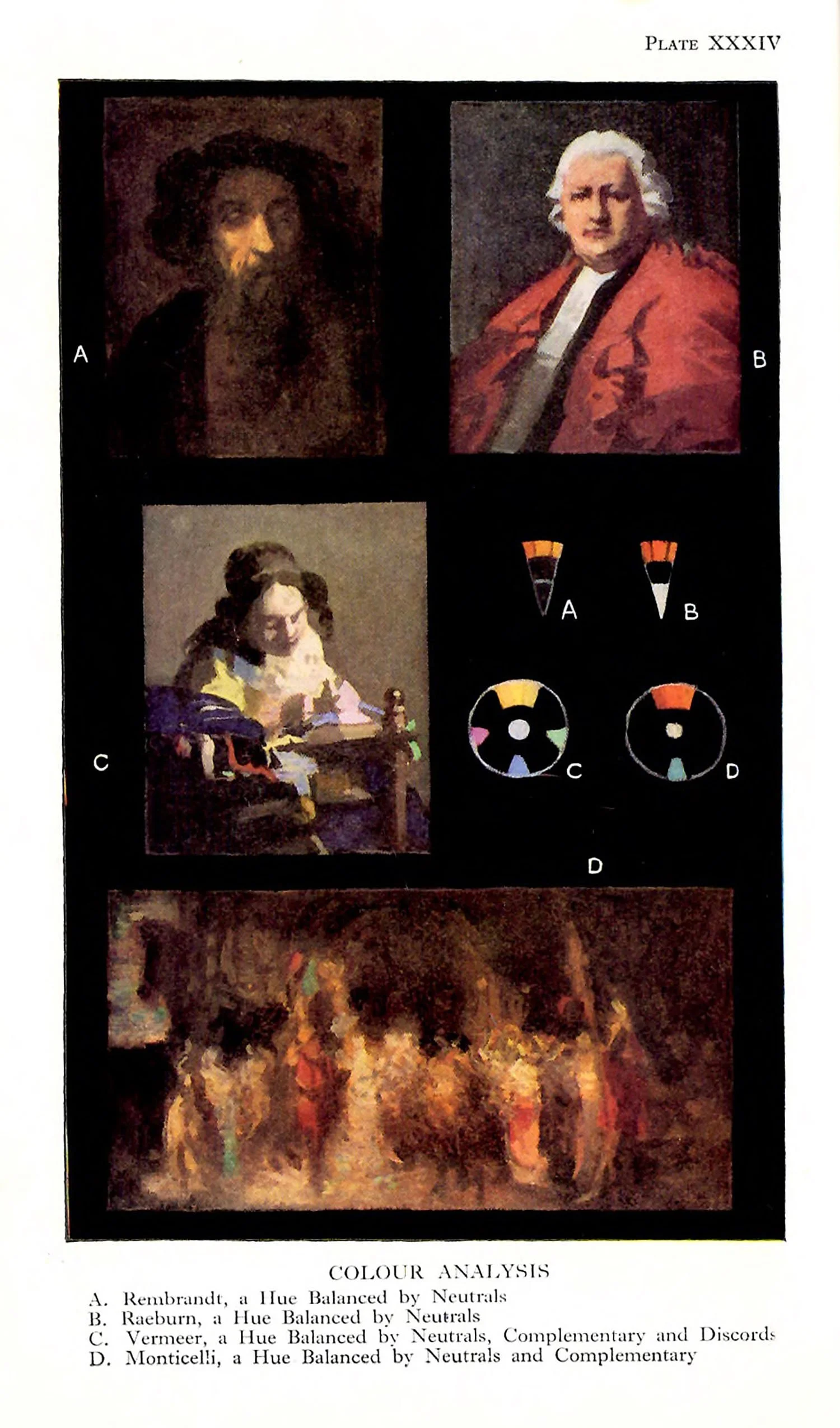
Two schemes ate illustrated in A and B, Plate XXXIV, each giving predominance to a hue. The description of method must be understood as an attempt on the part of the author to put clearly what is eventually requited in such a scheme.
A picture can and should be painted according to technical traditions, the actual execution having little or nothing to do with composition, apart from consistency of treatment. What is really required by the student is a system of colour-| relationship quite independent of any medium.
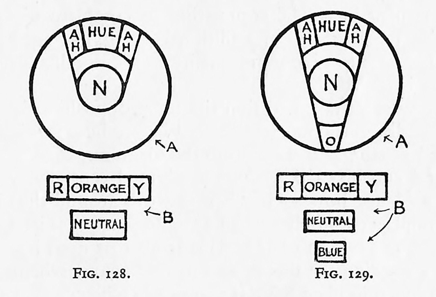
In the next colour-exercise our aim is still to give value or predominance to a given hue. The two adjoining diagrams, Fig. 128 (A and B), show what has already been attempted in our first corout-adventute. Both diagrams give the same scheme.
If the diagrams are altered to Fig. 129 (A and B), we find the wedge extended to teach the complementary hue (blue). Diagram B is a quantitative rendering of the same scheme as A.
When this hue is introduced into a scheme similar to our last exercise an additional cheerfulness is given. In a picture such a hue allows us to eliminate some of our neutrals, and also tenders possible a natrowing of the range of dark and light.
If the neutrals can be said to act as a tonic to the dominant hue, this contrasting hue can be said to act as a “super-tonic,” and great care must be taken to restrict its area, or competition will arise, and we shall no longer be certain of the dominant hue. The contrasting or complementary hue must be regarded as an additional qualifying agent, and when it ceases to give more quality to the dominant hue its mission is ended.
Care must be taken to find the exact opposition hue, for if it spreads out too much towards adjacent hues it is inclined to lose its “sting.” If we turn to the diagrams, Figs. 128 and 129, and consider the wedges as pivoted centrally, we can see at a glance how such schemes work around the circle; for example a green-blue scheme would Possess, at its wedge-point, an opposition of red. This is all that need be said at present tegarding the theory of this first colour scheme. The illustration A in Plate XXXII shows this scheme.
In practice the student is advised to carry out schemes on the lines indicated through the whole gamut of colour. Pictures and colour-schemes generally should be consulted. The student will be amazed to find the large number of pictures that have been painted on such a basis of colour arrangement. A few such pictures are analysed in Plate XXXIV, A, B and D.
Nature often suggests such colour-schemes—the purple-blue evening with its yellow spots of light, the cornfield against the grey sky, the cornfield with white clouds and blue sky. At the risk of repetition it must be urged that the student should remember his rectangular area as a limiting shape if he paints such a subject. It is within this shape that his cornfield, white clouds, and blue sky must be arranged. It is the areas allowed for the orange, neutral, and blue that contribute to his success or failure.
If, indoors, we observe a dark-blue vase containing orange marigolds against a grey wall, we have again the question of areas and relative saturation to deal with.
Nature makes every colour-scheme a success, and this is probably due to the fact that we arrange her illimitable areas as we appreciate them. A great deal can be learnt by arranging colour-schemes in groups of still life on the lines that have been suggested in the exercise. It is an excellent training to arrange the colour-scheme of a room, and although such opportunities are rare for most of us, we can study other people’s rooms. We should consult our feelings first, not our intelligence. We should say to ourselves, “Do I, without any theorizing, feel the colour-scheme to be satisfactory?” Whether the answer is “Yes” or “No,” it is then our business as artists to use our intelligence and find the reason.