Chapter XVI.
Colour Exercises
EXERCISES on the foregoing system of tabulation should be practised until the student can give a colour its approximate formula, If the formula be given, its visual counterpart should tise up in the mind, and when appropriate materials are available no difficulty should be experienced in making a colour conform to the formula.
Further exercises to give discrimination might be arranged as follows :—
(a) Similar hues of different tones.
(b) Different hues of equal tones.
(c) Similar hues of different saturations and different tones.
(d) Different hues of equal saturations and equal tones.
(e) Different hues of unequal saturation and equal tones.
Many other combinations of terms, all helping students to see and intelligently define colours, could be devised, the objects and methods used must be left to the judgment of the student and the teacher. Munsell and many others have considered such variations at length (Munsell’s Colour Notation).
Black, white, and the intermediate greys, of any area, can be considered as neutrals, and do not admit of saturation, owing to a difference of lucidity. The neutrals, of course, have a basis common to all hues—that is, in tone.
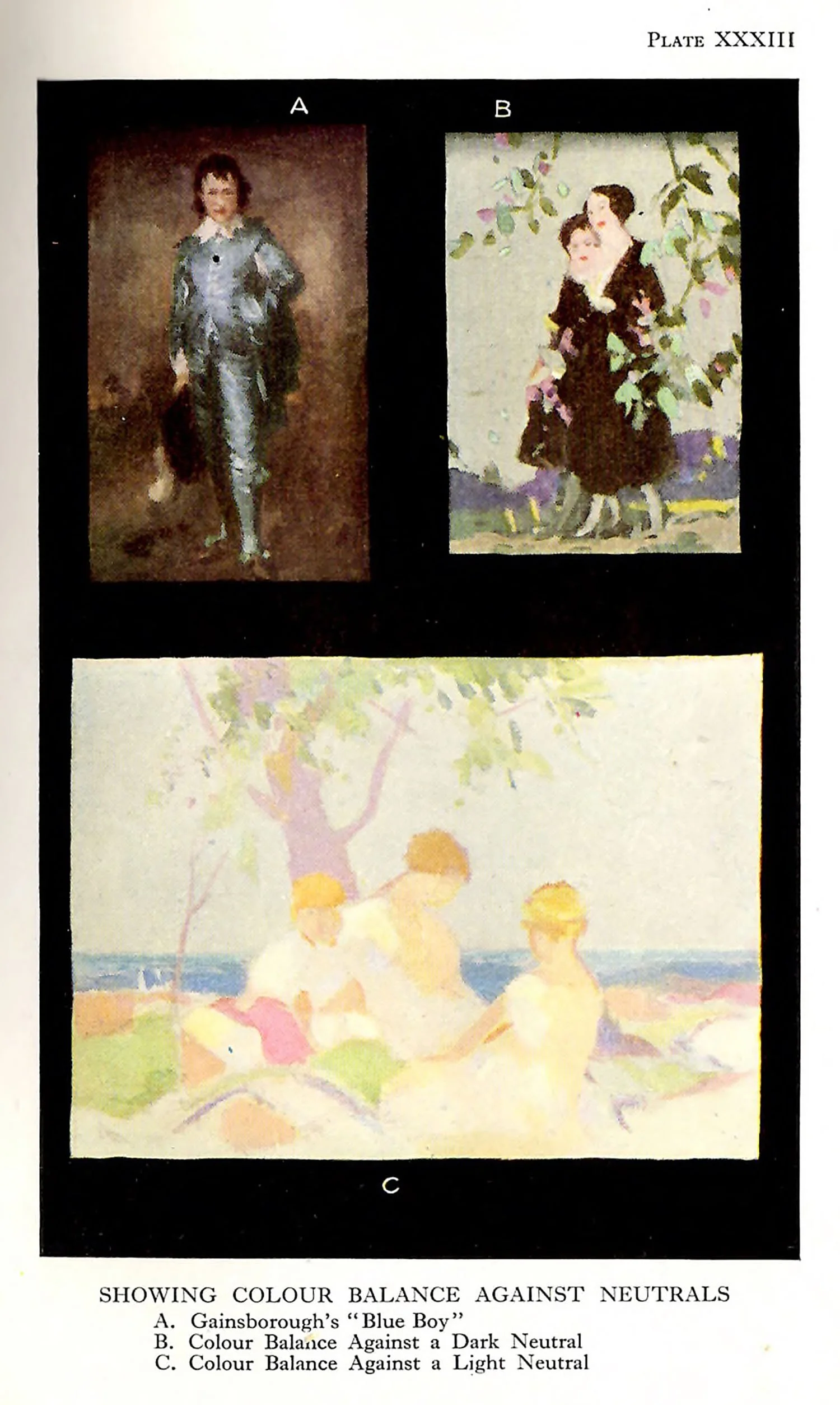
No visible hue, and consequently no saturation, is present in a true neutral. A great deal has been said by Chevreul and others about the effect on a neutral of a hue in juxtaposition to it. There is a tendency for a neutral to take on a hue opposite to or contrasting with a hue placed against it. If, for example, a true neutral is surrounded by red, we find our so-called neutral turns greenish-blue. What is meant by neutrals in composition is a corrected neutral. A gentle adjustment is often called for in the association of neutrals with hues. It is essentially a condition of the blacks, whites, and greys that they should actually “appear neutral.”
A very small atea of strongly-saturated colour can be balanced by a large area of colour of a weak saturation. Corot was fond of painting small areas of strong saturation, the remaining larger areas being almost neutral. A small red or blue cap, a light red or light orange roof against the grey-gteen or grey-blue trees and sky formed the basis of most of his colour-schemes.
Hues demand more saturation as they become smaller in area, in order to compensate, or, shall we say, in order to live alongside of their larger neighbours. If such a condition of relative saturation be stated technically we might say: “In any composition into which colour enters the amount of saturation should be inversely proportionate to the size of the areas.” Such a statement implies that we ought to be able to see without difficulty the whole of the areas at once in an equable manner.
There must be a certain equality of titillation, which is another way of saying that a composition must have its areas “adjusted” in the saturation sense. Suppose two equal areas to be lacking in this adjustment in the saturation of their respective hues, the one, let us say, red (vermilion) and the other green-grey (a weak saturation of green). We shall realize even without making the experiment that there is no equality of titillation, for the red area leaps to the eye, but the other hue seems to be retarded, and we are almost unawate of its existence.
It should be seen at once that if one of the areas in a picture or decoration is unduly saturated as compared with its adjacent areas, the strongly-saturated portion breaks up the unity of the colour-scheme, and we are conscious of parts of the same picture at different “time” intervals.
A picture can be, as a whole, weak in saturation—a pearl-like creation, or it can be, as a whole, strong in saturation—a veritable ball of fire! Again, a picture in its smaller areas may be strong in saturation, with larger areas weaker, and this is what happens in the average picture, the reason being that the colours are made to “fit,” have been “adjusted” to suit a pre-arranged set of lines or boundaries and tones. We shall discuss, later, some methods of avoiding this restriction, for it is obvious that freedom of colour is not achieved in this latter condition.
The area-saturation theory outlined above is of outstanding importance in practice, and must be taken for granted in the discussion of the colour-schemes that follow. It will be useful to visit the galleries with the object of consulting pictures, and above all, of consulting one’s feelings, in order to be convinced that this theory is tenable.
Plate XXXI shows two degress of saturation used in a similar composition.