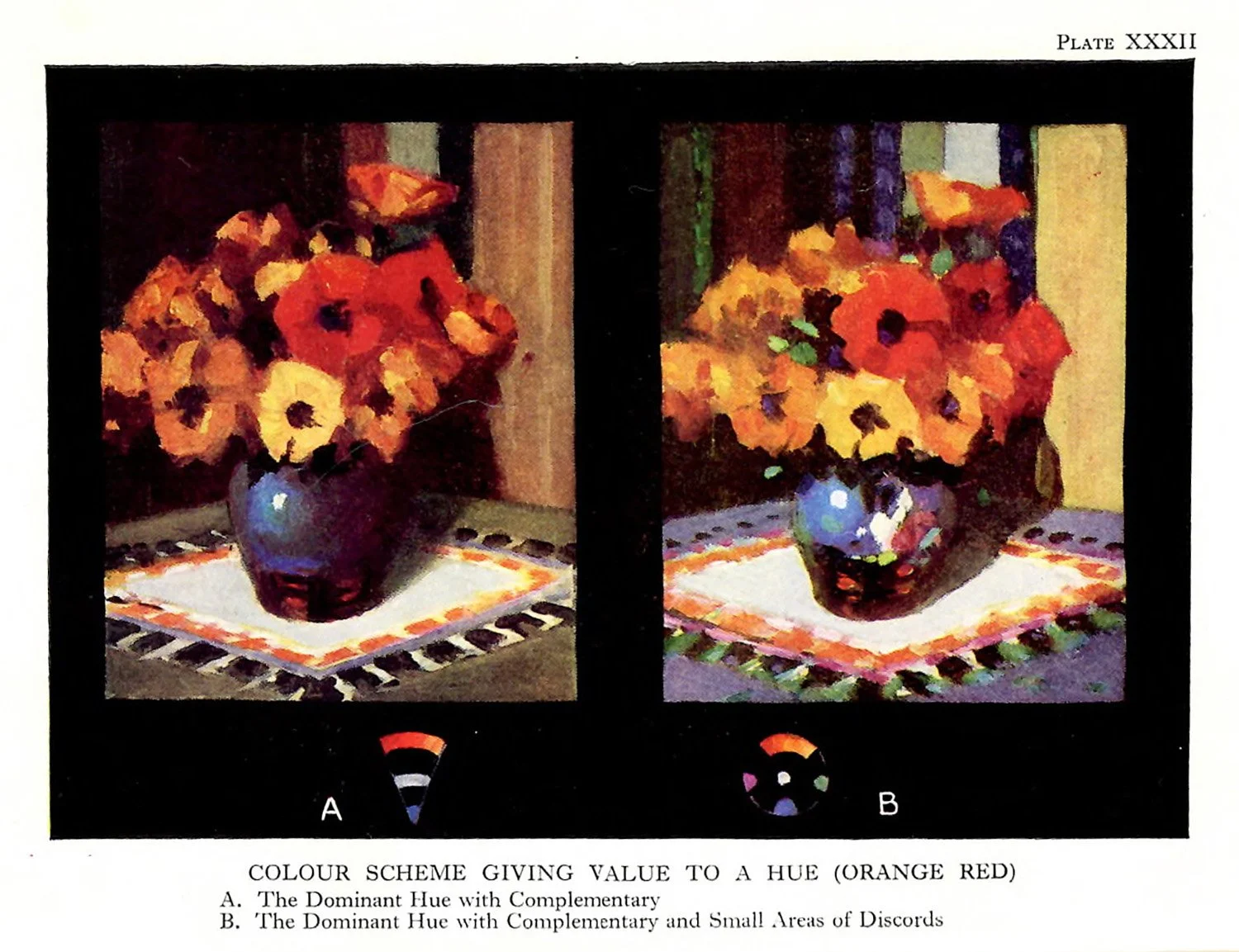
Chapter XV.
Colour
THE mystery of colour, with its fluctuating phenomena, has been a favourite subject for speculation from the earliest times, for it has been, and still is, associated with rituals, feasts, rank, and the whole gamut if the emotions. To-day it occupies the attention of the physicist, the psychologist, and the artist.
Whilst the physicist examines the laws governing its appearance with delicate instruments at hand, ready to measure its varying aspects, the psychologist notes its effects on the individual mind. The one measures the stimuli whilst the other observes the response. Perhaps the artist, who generally understands least of all this intellectual aspect of colour, is the person who really enjoys it, for it is his task to enter the world of colour, to examine its beauty by the subtleties of his feelings, and, having examined, it becomes his further task to create afresh, with very limited means, something of its orchestration.
Over a hundred years ago Goethe observed a veritable fear of everything scientific on the part of the artist, for he remarks: “Hitherto among the painters there has been a fear and a positive aversion to all theoretical study of colour and what pertains to it...” Yet the old masters were profoundly interested in speculations regarding colour, and in more modern times Sir Joshua Reynolds left us discourses that showed his keen interest in its qualities. When the present-day student attempts to grapple with what is known about colour, with what has been thought on the subject in the past, together with present-day research, a mighty pile of books looms up dealing with its varying aspects, methematical, optical, chemical, and psychological, with here and there a dissertation on “the beauty of colour,” and occasionally a volume is found where colour in relation to certain crafts has been considered.
It is small wonder that the art student turns away from the prospect of such prolonged research, and decides that the best and quickest way is to open the paint-box and by means of trial and error find out what most readily gives satisfaction. What is really required is a conception of colour that applies to every medium and occupies a secure position behind their varying qualities. Such a conception should allow the utmost freedom possible, and should enable the student to locate quickly the weak link in a given colour-scheme. It must be a working proposition so simplified that no teference-chatts or any pataphernalia are necessary. It will be seen that if such a scheme is to be made possible only a very few aspects of colour can be essentially useful, and the rest should be treated as a side issue.
For example, the art student must not confuse light with pigment. Pigmental colour is the medium to be used, whether mixed with oil, water, gum, egg, or wax, and whilst the student is concerned with painting there is no necessity to be burdened with theories concerning light: its wave length, its combinations, and the other properties and laws that specially govern it—indeed, all that can be reasonably asked of the scientist resolves itself into two questions:
(1) What can be said tegatding permanence of colours in their manufacture, mixture, and application?
(2) What is the simplest method of tabulating colour—of giving it a name—in order to discuss its relations intelligently?
In a book on composition, question one can be omitted, for composition is only indirectly concerned with permanence and technique. It is equally certain that no useful discussion of colour can be carried on unless question two be answered.
While such terms as “tint,” “shade,” “brightness,” “dullness,” “‘paleness,” “vividness,” and so forth, are used to mean many things, confusion is still more confounded when names of colours such as “brown-pink,” “nigger-brown,” [note: I have decided to leave this offensive term here as it is in the original text because it is unfortunately a product of its time; however, I most certainly do not condone its use] “garter-blue,” “stone,” “buff,” etc., are used. It is only necessary to pay two visits, one to the draper’s shop and another to the ojl and colour-merchant, to discover the chaotic condition of colour-tabulation. Who amongst us on sitting down in a room and noting the simple flat colour on the wall could write down a request to a colour-merchant or a draper, and by any possible name secure a pigment or material that would match it?
First, then, as a necessity for intelligible discussion, we must seek for a method of notation: a direct, certain, systematic tabulation of colour, and, thanks to the efforts of Munsell and many others, this has been done efficiently enough for all artistic requirements.
A method of tabulating colour is here given:
Every colour, as we see it and temember it, can be considered under three aspects; these ate: hue, tone, and saturation. Hue may be tegarded as the position of a colour in sequence, starting, let us say, with red and traversing the following track: ted, otange, yellow, green, blue, purple, crimson, and back to red again.
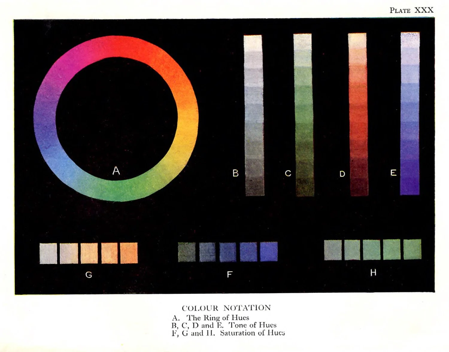
If a ring containing the varying hues be made as in Plate XXX A, this sequence will be obvious. The student should not waste time at this juncture by drawing parallels between such a ring and the spectrum. We do not want infra-red and ultra-violet and the dark bars to confuse the issue. A ring made up of pigmental colours is being considered now. Such a ting with the simple terms red, orange, etc., will be familiar at once to all, and it is now hecessary to observe a little more closely. If we start once again from red towards orange, an intermediate hue is easily distinguishable. It shall be called red-orange. Again, intermediate hues could be discovered between all the other single-named hues and called by their combined names—orange-yellow, yellow-green, green-blue, etc. To define still further requires a little training in hue-perception. Thus red-red-orange would indicate a red inclining to orange, and yellow-yellow-green would similarly suggest a yellow inclining to green, In writing down such hues the first letters are convenient, thus: R.R.O. (meaning Red-red-orange), O.O.R., B.B.G., and so on.
To carry such a definition farther, if the student’s perception is strong enough, would bring R.R.R.O—that is, red with a slight trace or leaning towards orange. Here we come up against the necessity of very definitely known standards, such as the red of sealing-wax, which is a red that might be said to be inclining neither to crimson not orange. We may be sure that when art education advances we shall have such tests and exercises in school, and standards of colour will be formed at a specially impressionable age. Enough has been said, however, to show how hue can be perceived and defined.
Then comes the second aspect of colour, which we have named tone. Tone is the “lightness” or “darkness” of a hue.
Thus blue could be so diluted with water that only a highly-trained eye could detect its presence; again, it could be so darkened that it would become indistinguishable from black. Hence at extremes it would be necessary to have starting-points of white and black. Starting from white with the faintest trace of blue, the scale would descend and become darker and darker, the blue more and more pronounced, until about three-quarters of the way down the scale it would reach its maximum blueness, (after which its blueness would fade imperceptibly into black. Thus it is possible for any hue to start from white and end in black. This is the tone scale, and it can be conveniently graded from 0 to 10, No. 0 being white and No. 10 black. This grading admits of only nine grades, and this is convenient for a rough estimate; but here again it is the business—the practical business—of every art student to become sensitive to at least twenty of such intervals.
For anyone who has any difficulty in grasping this quality it might simplify matters to consider this tone-definition as the photographic quality—the lightness or darkness a colour has when translated into monochrome. But here again the camera is by no means reliable, even with panchromatic plates, for so many factors, such as development and printing, enter into such a calculation that the standard is far from absolute. If, however, the camera translated into monochrome what the eye sees as light and dark we should have the standard required.
Diagrams B, C, D and E, Plate XXX, illustrate the quality above mentioned.
We may now consider the third aspect: that of saturation. Saturation may be defined as the scale between absolute neutrality (that is, greyness) and purity of hue—without altering the tone.
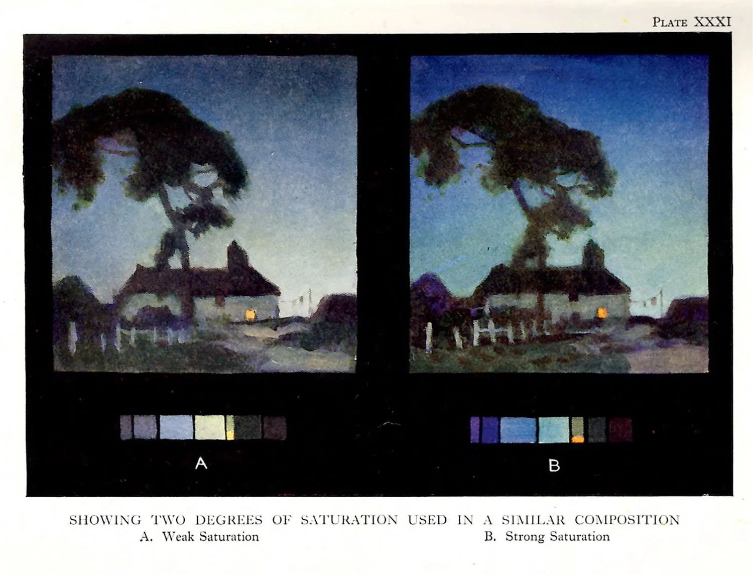
Reference to diagram F, Plate XXX, will show a small square of neutral grey, tone-number (allowing for reproduction) approximately No. 7 on a No. 0 to No. 10 scale of light and dark. At the other end of this diagram is a square of blue, also No. 7 on the light and dark scale. Three other squares are placed intermediately, which are also No. 7 on the dark and light scale. An increasing degree of blueness will be observed in all the squares except the first (the point of departure—the neutral starting-point). This is a rough indication of the scale of saturation. Again think of the definition: Saturation is the departure from neutrality to absolute purity of hue without altering the tone. The scale, like all other scales, is only arbitrarily divided—in this case 0 to 5—and again it must be indicated that subtlety comes with practice. Two other diagrams of saturation are given in G and H.
To give a colour-notation, then, it is necessary that the three qualities, hue, tone, and saturation, should be understood:
It is the browns that are apt to cause confusion in their notation. For example, it is a little difficult at first to recognize raw umber as a dark orange-yellow, yet when such a notation has been mastered it simplifies the issue enormously by cutting out all the pet names, art shades, precious-stone analogies, primaries, secondaries, tertiaries, and the like.
One way of grasping the colour-notation as a whole is to consider a sphere the axis of which is neutral, starting at the top with white and descending through tones of grey to black, as indicated by the layers in Fig. 125.
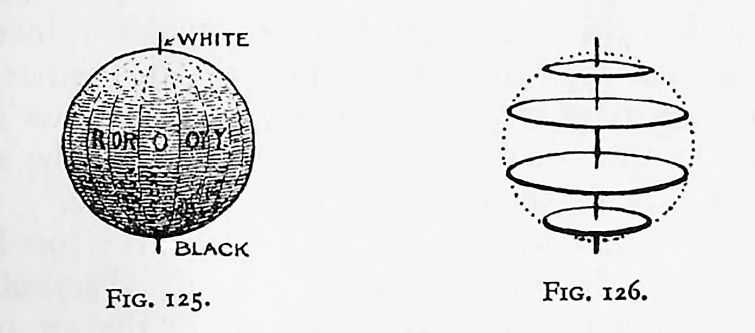
Then consider that the lines of longitude represent differences of hue, as shown in the same diagram. A section would have its core or centre as neutral grey, gradually becoming more and more saturated as it approaches the circumference, where full saturation should be reached (Fig. 126). Yet the tone on each successive layer would remain unaltered.
Such a demonstration of the whole scheme of notation would appeat at first sight to be the obvious manner of teaching. In practice, however, with out present pigments unequal in their possible saturation at any given tone, the sphere would alter and give place to a potato-like shape, or irregular ovoid.
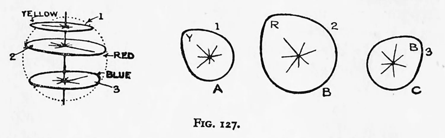
A short consideration of a few colours will show this. Let the axis, starting from white and descending to black, be taken as before (Fig. 127). In the sections referred to all the surface is equal in tone. Take disc 1 and consider relative saturations. On examination it will be found that the possible saturation of yellow at this position in the scale is far greater than is possible with some of the other hues, hence its true shape would be more like Fig. 127 A. Again, take a disc (or section) a little farther down the axis. Here red will be found to be more capable of increasing saturation than the other hues (Fig. 127 B). Farther down the axis once more we find that blue causes, by its intense saturation at this tonal level, an irregularity in the section (Fig. 127 C); hence the departure from the sphere.
Although it has been said that “it is never too late to learn,” it must be admitted that if such a discrimination of colour could be taught at school, both the art student and the colour-loving public would be saved from the muddled terms now in use, and it is not too much to expect that some day the researches of Munsell and his fellow-pioneers will receive the recognition they deserve.
The Munsell colour notation system has been adopted by the American Standards Association as industry’s language and standard of colour. Munsell’s system is, perhaps, the easiest working system to grasp. In more recent times Wilhelm Ostwald has been able to give us an even more scientific account of colour science. Many of the earlier researches of scientists, such men as Helmholtz, Maxwell, Hering, and Fechner, have been put into their proper perspective. Several controversies have been settled, and a very correct notation has resulted. For the reader who is especially interested in Ostwald’s theories on colour I cannot do better than refer him to the work Colour Science in two volumes, which is an authorized translation of Ostwald by J. Scott Taylor, M. A.