Chapter XIII.
Recession
WHEN all the efforts to give recession to a picture have been made it should be remembered that it is the two-dimensional design that holds the key to success. If the shapes are unfortunate on the flat—that is to say, unsatisfactory in the two-dimensional sense—no amount of zeal in dealing with the qualities of recession will make a good composition.
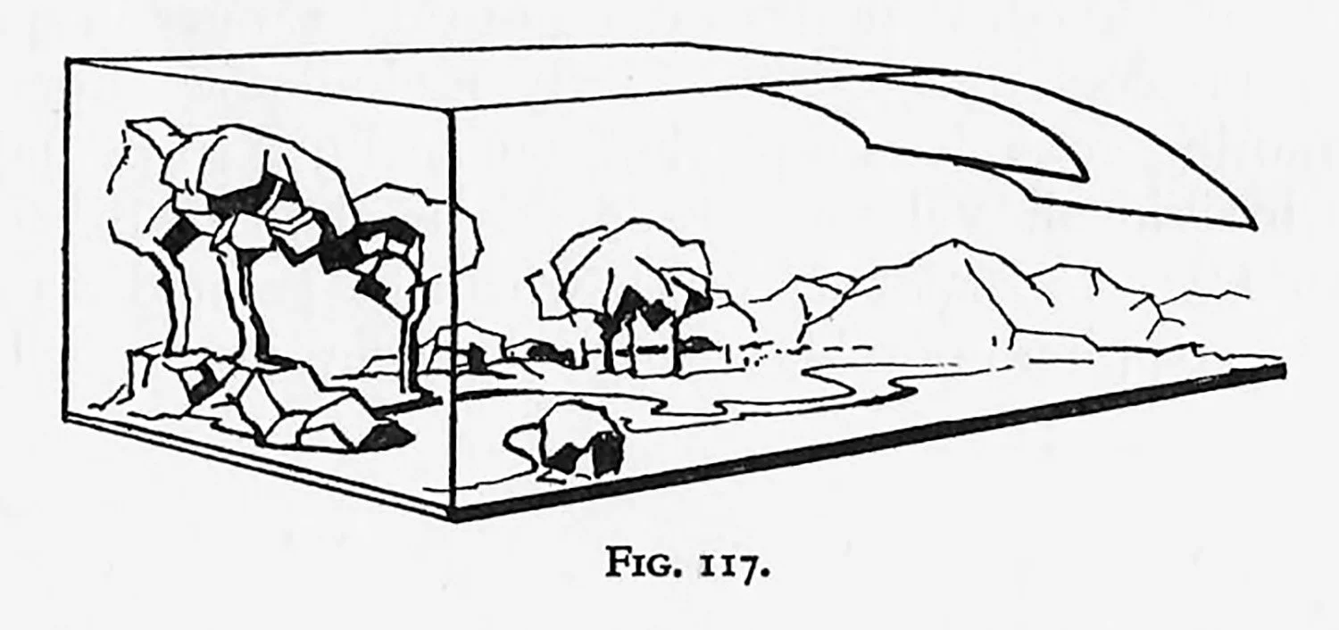
In order to grasp the plan of a recessional picture let us assume that we are looking at it as a side-elevation with the objects arranged to agree with the front view. The diagram, Fig. 117, suggests an expanding box or dome-like recession, and it is the formal or informal arrangement of objects on such a stage that calls for our attention. In the early part of the chapter on Perspective attention was drawn to pictures that have a slight recession, as shown in Figs. 94 and 95, and to the fact that the figures were arranged with a background of close-up buildings or sky. The figures held the interest and the recession was slight. It is when we go farther inwards that the real troubles connected with depth begin to assert themselves, arid the problem of the “way in” begins.
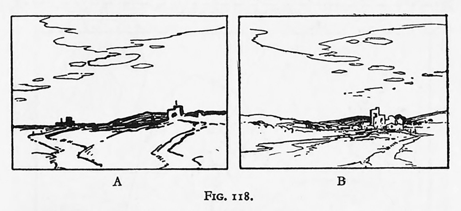
The novice often commits the error of allowing the attention to be distracted by means of divergent paths to two unconnected objects within the picture (Fig. 118, A). This duality of intention causes confusion. Many tracks may be used if they tend to converge towards the main interest (Fig. 118, B). Sometimes a composition possessing interesting sides lacks a greater interest centrally. A hollow space is suggested that carries the spectator inwards to a feeble and uninteresting distance. On the stage the wings may be interesting, but it is the central portion occupied by the actors that holds our attention.
This line of thought brings us{to the conclusion that every recession should justify itself. Opposition planes or screens that go from side to side of the picture have the tendency to arrest recession. When the areas of such obstacles are large we are tempted to examine them two-dimensionally, and if their forms prove interesting we are delayed still longer. In practice objects of this kind are accompanied by transitional planes. If they still prove unsurmountable they may be reduced in area until finally they become mete undulations and no longer impede the eye. Our obstacles, then, should be so arranged that they give the desirable delay in our approach to the chief interest.
It must not be forgotten that plausibility enters largely into the problems of recession, for comparative sizes are inevitable, and certain near objects are sometimes known to be far more powerful in tone in comparison with the tone of what we wish to be the chief interest, which lies farther within the picture. By reason of such a rivalry it will be clear that the greater the recession of our main interest the more delicate and critical the task of leading the eye to such a position will be. If the objects that retard are too attractive we stay, and when they are not attractive enough we reach the distance too soon.
Many devices have been adopted to ensure the desirable progress, and many of the books on landscape painting offer advice on this difficulty. The serpentine, or winding line, is perhaps the best known. It may indicate a toad, a stream, a flock of sheep, or clouds, but no matter what objects are suggested it is the to-and-fro character of the lines that delays. This method, although well known and well tried, is not always employed intelligently, for it is liable to be used in too obvious a manner, without breaks or subtleties and the variety that is so necessary in informal design. One of the most interesting solutions of recession is often found in etchings, and sometimes attempted in the art work of Orientals.
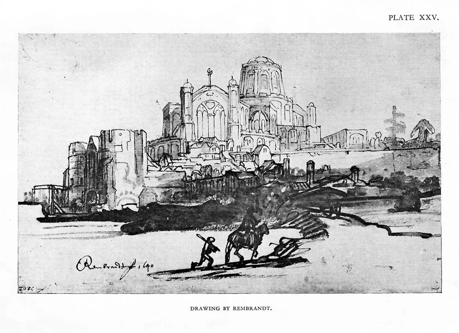
Line is used for all the shapes that are selected to occupy the rectangle, but it is mostly in the distance that the forms become specially interesting. The near trees, buildings, and figures are suggested by strong characteristic forms often with little or no tone, and the more remote objects are given special attention with regard to delicacy of form and tone, so that we are encouraged to look at the mote satisfying distance. (Plate XXV, a drawing by Rembrandt, gives one aspect of such a convention.) This compromise, which is suitable enough for such a form convention as etching, lacks solidity if it is attempted in a more robust medium, such as oil-paint.
Most painters attempt to obtain correct tonal relations in addition to form, and we frequently find loose handling or a summary treatment with emphatic brushwork on the nearer objects. This treatment diminishes to a more delicate execution as the recession increases. This facile and fashionable method, which demands great cleverness of execution, is inclined to divert the attention from the more satisfying qualities of good design. Canaletto and many others have shown that methods less turbulent in character may still succeed.
When we turn our attention to figures and their arrangement we find that the range of effective recession is usually far less than in landscape. The distance becomes an accessory to be used either to enhance the movement of the figures or to act as a foil in giving repose.
If figures are grouped across the picture the contour becomes very important as shown in the Giotto design (Fig. 96). Sometimes it may be an advantage to substitute “advancement” for “recession” or to arrange the design to work backwards or forwards from a given plane or position. What is of vital importance is that the scheme should be organized in the simplest manner to achieve a satisfactory design.
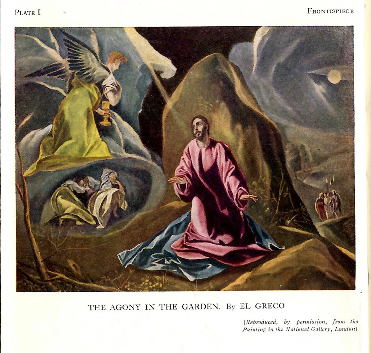
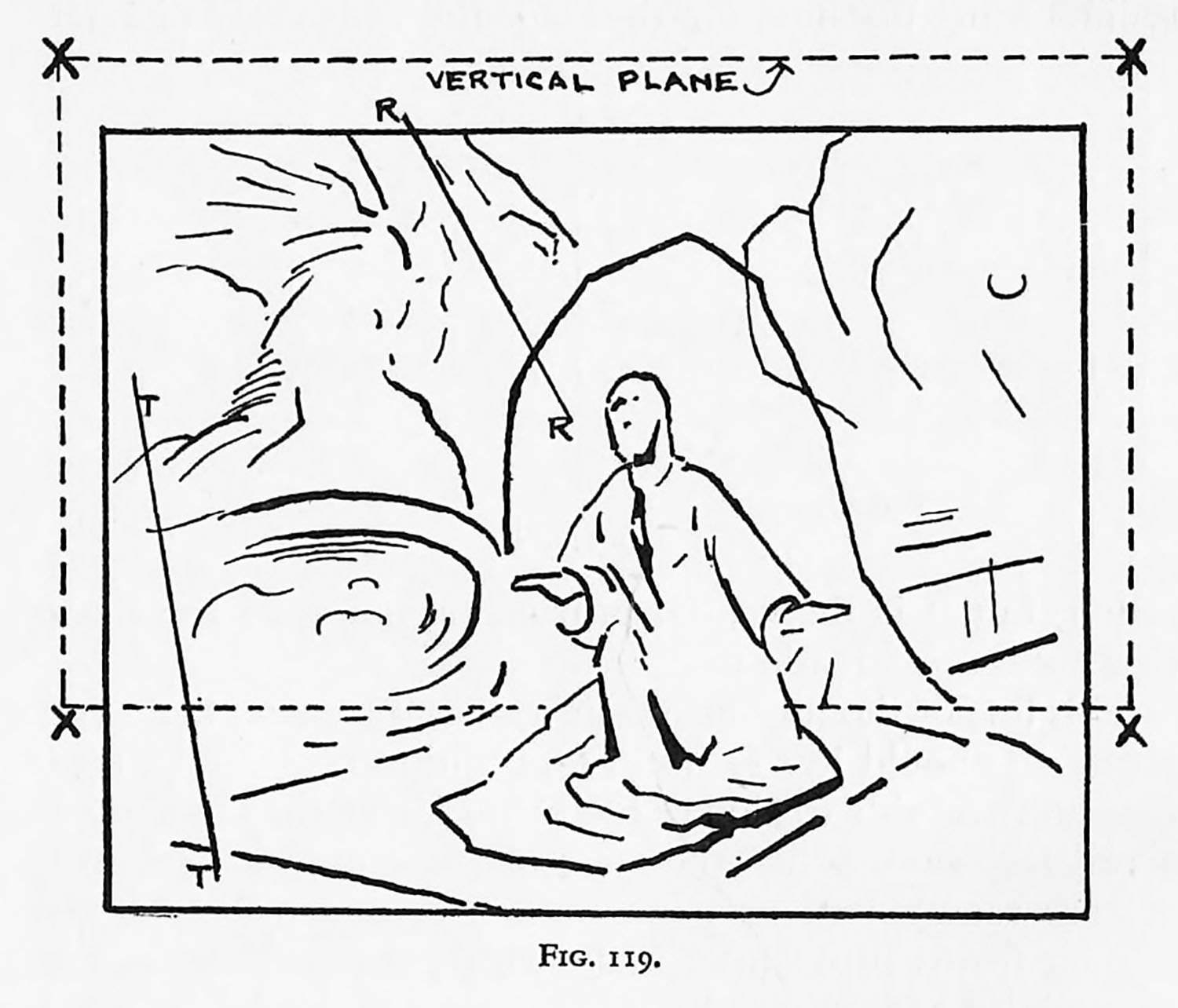
Let us examine the El Greco composition shown in the frontispiece. In order to simplify the analysis we will assume that a vertical plane is placed as shown in the diagram Fig. 119. The four corners of this plane are at XXXX. It will be seen that the figure in front of this plane consists of volumes and planes that advance towards the spectator. On the vertical plane itself is a rock-like shape behind this principal figure, whilst behind the plane cloud-like forms recede. To the left of the figure is an elliptical shape, the edge of a hollow or concave space containing the sleeping disciples. Above this elliptical shape the winged figure is found to be convex or conical in character. It will be seen that volumes and planes are arranged extending in opposite directions with rounded (solid), hollow, and flat variations. This diversity gives the composition a remarkable vitality and sense of space. In spite of all this diversity, unity is secured by emphasis of tone on the central figure and by the use of the diagonals (the tree and the ray) T.T. and R.R.
Many other aspects and qualities could be discussed regarding this composition. Perhaps it ought to be said that we find El Greco juggling with the properties or compositional units without too much reference to the naturalistic probabilities. In this way the artist has achieved intensity of feeling and allegorical expression. With practice the student should become proficient at arranging the factors or units of design, and a compromise between nature and att should come into being. A desirable and individual approach can be developed by this means. A critical study of the masters should inspire the student to ask himself, “What is the compositional aim in this picture? What kind of design factors have been used or rejected?” Such considerations in addition to the study of nature will greatly assist the progress of the student.