Chapter VIII.
TONE TRANSLATION
AFTER continual practice a time will come in the student’s experience when tone distribution and tone organization becomes almost sub-conscious. It will almost always be necessary to try out several alternative tonal schemes until, at last, a version emerges that gives satisfaction. Now we arrive at a point where it is desirable to consider the ultimate medium in which the design is to be carried to its final expression. The tonal scheme is now organized in its simplest terms and it still remains necessary to adjust and amplify it to agree with the possibilities of the chosen medium. Providing the student has gained experience in the use of several alternative mediums, the problem of deciding the one to be used soon resolves itself. It is quite likely that a certain medium has been chosen even as the design was being organized, and a vision of the design in its appropriate medium has already asserted itself in the mind. Before embarking upon the actual or final production in the chosen medium, various modifications to the design will be necessary at this stage.
A few suggestions just here may be of service. Assuming that the student’s mind is well stocked with forms and appropriate textures it is advisable to start straight away whilst the design is still “fresh” or “alive” and the desire to create is strong. It must be allowed, however, that most of the great artists are capable of keeping or maintaining their enthusiasm and inspiration over a period long enough to see the picture advanced to the maximum of their ability. A cat-like persistence—a powerful determination to make his design succeed—must become a fundamental part of the artist’s character. A large number of students fail through getting tired of the design they started. Either their enthusiasm wanes, the design does not seem as good as it was, or some other design comes into view which, in its turn, grows stale. Whilst this state of things lasts progress in the arts for such students is very slow. It cannot be emphasized too strongly that most pictures owe the failures they exhibit to a flagging interest or impatience in these intermediate stages. A picture, apart from original ideas and inspiration, should also be a job of work, a product of good craftsmanship.
Let us suppose that oil paint is the medium to be used in the execution of the design. It will be clear that a colour scheme of the design similar in tones to the original tonal scheme should be attempted. This should be carried to a point where the colour organization is understood. Drawings for reference should be made to save all sorts of experimental fumbling when the final picture is begun. Even then, with all this care and forethought, troubles will occur but the chances of success will be greater. Similar tactics should be adopted if a water-colour is to be painted. It may be that the colour sketch will show the student that the dark and middle tones can be smaller in area than the first tonal scheme. A slight adjustment in this respect may be required to remove the heaviness which is inclined to occur. The limpid and flowing qualities of water-colour are desirable and modifications to ensure these characteristics may be necessary. A watchful eye should be kept on all edges and a cautious introduction of extra planes, receding, vertical, and horizontal, would give variety and remove the flatness. Every medium calls for its special form of treatment and the work only succeeds when such modifications are made in the pictorial translation. The first statement, the tonal sketch, is still of great importance; it stands as a symbol of organization of tone and should always be at hand. With a medium such as colour printing from wood blocks, or linoleum cuts, scarcely any modifications are necessary; at most a few gradations in the larger areas and a little more significance given to the “outline block.” It is in wood engraving that the translation becomes mote obvious. A wood engraving is considered as a medium that prints in black, and something must be done to give the sensation of greys and whites that possess quality. If this medium of expression is undertaken it will require a knowledge of textures that, seen at a distance, resemble the greys and whites of the original tone sketch. Textures usually suggest the characteristic or representational forms on the objects concerned. For example trees, grasses, tiles, bricks, stones, draperies—in fact all substances—can be textured according to their nature. It is possible to ignore such characteristics and use a more abstract texture. Perhaps it may be that the artist is more concerned with planes, curved surfaces, and textures that help the three-dimensional or special character of a design. One thing is common to both treatments. The textures, abstract or otherwise, should conform to the first tonal scheme—or disorganization is likely to set in. The greys and whites in the tonal scheme must be translated without essential alteration of light and dark into textures. One of the most useful means of studying textures for wood engraving is by the use of scraper board. This is a card treated with a white clay-like substance and covered with a thin layer of black. A well-sharpened penknife or similar tool can be used to scoop off the black thus exposing the underlying white. A point lightly applied will make a thin white line. This method of approach, which is one of making white marks on black, is in its effect very different from making black marks on white—as would be done with pen and ink. Such scraper board experiments are very closely allied to the use of gravers used on box wood for wood engraving and can be recommended for intermediate stages in wood engraving.
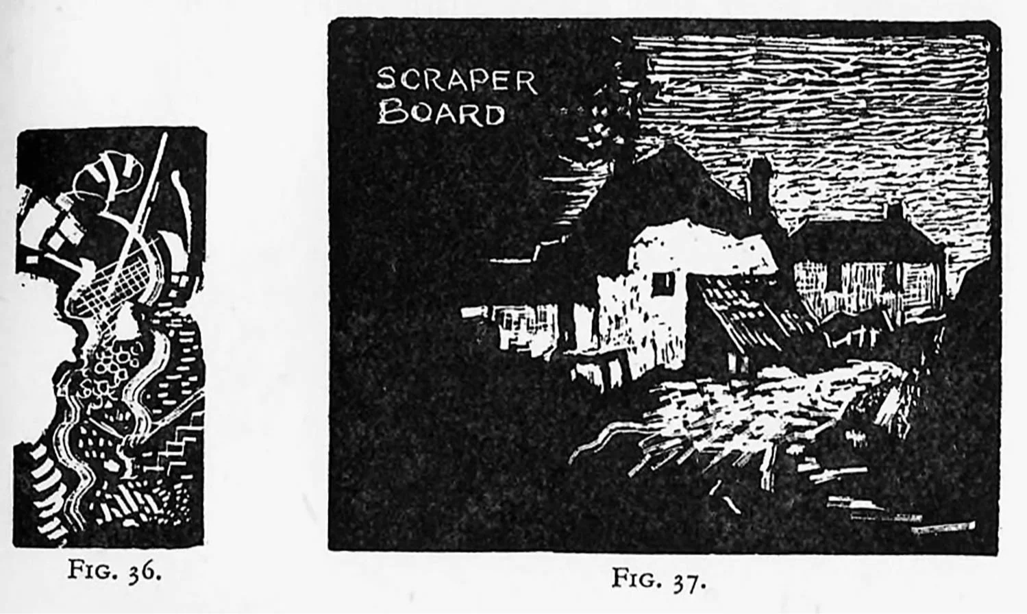
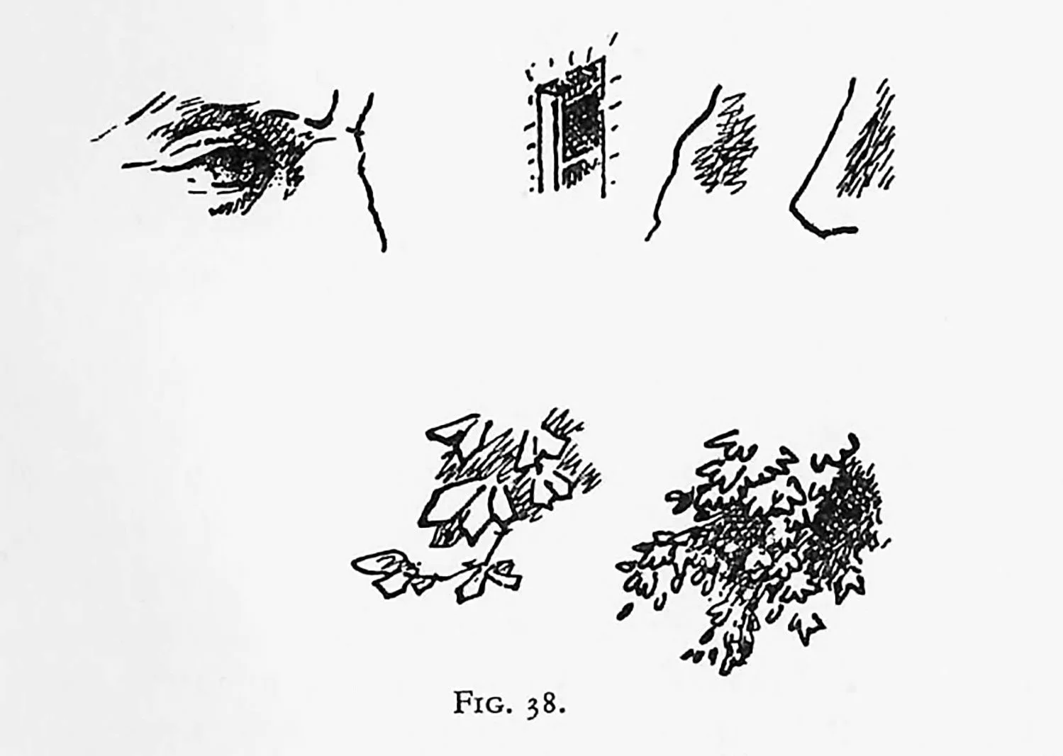
Figs. 36 and 37 illustrate such an experiment. If etching should be the chosen medium it will soon occur to the student that form must be given the prior claim. The lines that are used to translate the tonal factor of the scheme should always be less insistent than the lines that represent the form or constructive elements of the design. Every art master is continually being asked by students: “What direction should I draw these lines that represent the shadow of this object? Should I follow the forms suggested by the surface section? Should all my lines representing shadow be slanting and parallel?” These questions can only be answered by continually referring to the basis of the original sketch. If a scheme is to be translated in a linear manner—if a pencil, pen, or needle is to be used—then the significant forms that tell the story must not be interfered with or obscured by adjacent tones consisting of lines of equal significance. Tones must be tendered subordinate to forms. The diagrams in Fig. 38 give several illustrations showing the use of linear tones which at the same time keep the characteristic and essential forms dominant.