Chapter VII.
EXERCISES WITH TONE
Now that the main principles underlying “dark and light” have been enunciated, we may proceed to examine the best methods by which its full appreciation may be acquired.
If a student is to be able, at will and without conscious effort, to make his tonal schemes a success, a great deal of preliminary practice, considerable concentration, and all the critical power that he possesses will be involved. The materials necessary ate as follows: One or two good sable brushes; Indian ink; process white (or any good covering white); white, black, and grey paper.
The grey and black paper could easily be prepared from the white. It will be found easier in practice to compose patterns to fill small spaces. Such spaces can be surveyed at a glance, and are more under command.
The student should draw several small rectangles, about three inches long with depth to suit, on a piece of white paper. Such rectangles should not be too near to each other. A strong black line, drawn with the brush, defining these rectangles, is the best preliminary to this exercise. Other shapes, such as semi-circles and circles, may be introduced as variants as the exercises proceed, but the rectangle is the most troublesome, and in consequence the most useful. Let a start be made by placing an irregular spot (about the size of a threepenny-bit) a little off the centre of one of the rectangles. The size and the position suggested are quite arbitrary. When this first spot, wherever it is and whatever size it is, has been placed, it will be necessary to pause and calculate the best positions for the additional spots.
When these have all been placed we must ask ourselves the following questions: “Does this arrangement please me?” “Would another large or small spot in this or that position improve the design?” “What would be the result if a black spot were put down in this corner or if it occupied a position along this edge?”
If the result is not happy, if the arrangement cannot be enjoyed in the abstract—that is, without knowing what it represents—then there is something to be done that requires further thought. It is at this point in the exercise that greater and still greater efforts must be made.
There is no gain in making a fresh start in the second rectangle, however desirable it may appear, until some reason is found why the spot distribution in the first rectangle is not satisfactory. Perhaps the black spots have invaded the rectangle to such an extent that scarcely any white is left! We should work with white in the brush in such a case. This is a trying exercise, with very little immediate gain in sight, and yet it is the very basis on which a great deal of our aesthetic enjoyment depends.
There will be found a strong tendency on the part of the beginner to draw a few lines representing something, and from this basis proceed with the exercise. Such an idea is useless, for it makes the distribution more difficult. With no preliminary forms the student is free to put the spots wherever the feeling or fancy dictates, and the spots are not required to conform to any pre-arranged set of lines. Mental mobility, then, is an essential state of mind for such an exercise.
Similar conditions prevail if a spot is “turned” into some shape it already slightly resembles—a fish, a bird, or the profile of a face. Such resemblances cause the student to turn his attention from the real exercise ; the concentration that was required for distribution is consequently diverted to making other spots come into “form” relation with the shape that has become so realistic. Thus, while the imagination may be stimulated, the distribution is inclined to become secondary in interest.
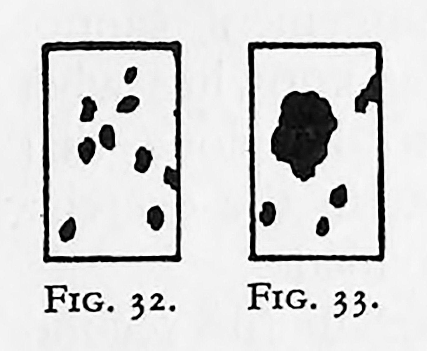
One of the troubles that occur in such an exercise is illustrated in Figs. 32 and 33 (lack of scale), In Fig. 32 thepattern suffers from equality of scale in the spots. In Fig. 33 the spots ate too unequal. It is useful, as the exercises continue, to make it a condition that one or two of the cornets be filled up, or one side, and the distribution started with this beginning. After the critical examination of many such efforts a discovery will probably be made. Certain distributions, appearing more pleasing or more successful than others, will be found to have one thing in common, viz., a certain consistency about the edges or forms, in a given rectangle.
Perhaps a rectangle will be found with an apparently impossible spot—it might be termed an ugly spot. Here we should pause to consider a question that will prove to be of immediate importance in later work. Is ugliness merely inconsistency?
A similar rectangle should be started with the alleged ugly spot arranged as nearly as possible in the same position and size as before. Now make other spots of a similar shape, suitably distributed and of varying sizes, and it is possible that the student’s former conception of ugliness will undergo a modification. A piece of white paper pasted over the offending spot in the first rectangle may have a new spot put on it, more like the others in shape.
The monotony of using black ink on white paper may be varied by using white on a black ground (Fig. 31 [shown in the previous chapter]). It is just as important that the white distribution should be as good as the black distribution, even in the same rectangle.
Grey paper of a middle tone—i.e. approximately half-way between white and black—forms the basis of further exercises in tone-distribution. When simple distribution has been to some degree assimilated, exercises in displacement should follow. Such exercises would consist briefly in:
(a) Placing the black spots so that their relation to the enclosing grey rectangle is unbalanced and then placing the white spots so that the feeling of balance is restored.
(b) Placing on a white rectangle a few small spots of black to be balanced by a larger area of the intermediate grey.
(c) Arranging on a black rectangle a few spots of white to be balanced by a larger area of the intermediate grey.
Alongside of such exercises the old and modern masters should be assiduously studied. Both Eastern and Western art bring a wealth of ideas with reference to tone-distribution. All pictures, good or bad, when examined properly, should add something to the personal evolution of the art student. The art galleries should be visited, and reliable reproduction continually consulted until the mechanism of dark and light arrangements becomes familiar. When a masterpiece is to be studied in tone, its analysis should be conveniently small, and the student’s attention should be directed to: (a) The proportion of the rectangle or containing shape; (b) the relative sizes of both light and dark areas; (c) the smallest number of tones that might be used in the analysis. Three-tone consideration is usually sufficient for a simple analysis. It has been found that when an unlimited number of tones is allowed the critical faculty invariably goes to sleep, and a banal, imitative copying takes its place. What is wanted by the composer in regard to tone is structural capacity. It is an everyday experience to see a student draw a few outlines and then put colour on the spaces with little or no attention to tone-structure.
Cruel as it may seem to limit the tones to three in such an analysis, it will appear even more drastic to prohibit gradation. Gradation is useful, as a servant, for certain purposes: To carry tone in a given direction without additional forms; to quell certain insistent boundaries; to give subtlety to tones. Gradation has, however, a decided tendency to hide structural tones, and should be used only when urgently needed. It has already been pointed out that when one area is gradated there is no resting until the other areas get their share, and this trouble in itself should warn the student that complications are waiting to engulf, or to cover up, what promised to be the structural pattern.
If the student can truthfully say all the time, “It is the tonal structure that I am studying,” then gradation can be taken into account.
Every capable painter who finds tonal troubles accumulating in a picture goes back to simple structure, and in doing so ruthlessly cuts out gradations and steers steadily towards a simpler statement.
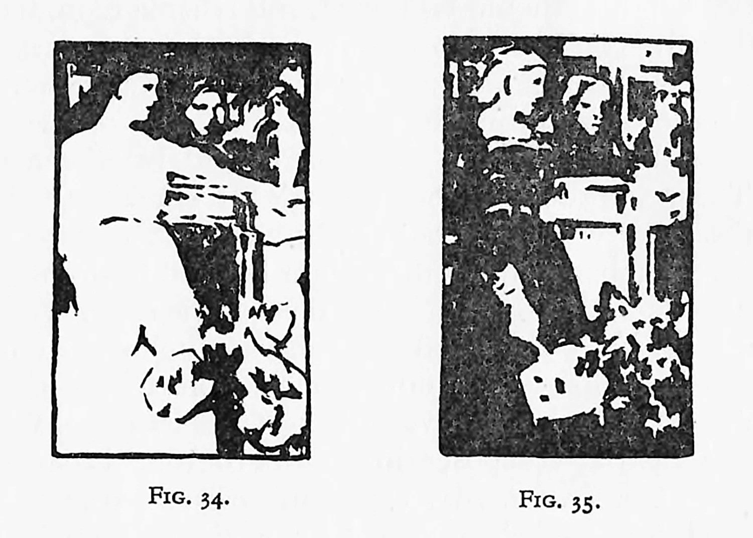
A very interesting and useful exercise is to select a picture with good distribution; then, on grey paper, draw two rectangles of the same proportion as the selected picture. Within these rectangles draw the key lines—the boundaries of the tones. In the first put down the darks and lights as they are in the original picture—simplified, of course; in the other rectangle put down a black in one of the larger areas that is white in the selected picture. Now attempt to solve the new distribution whilst still retaining the shapes. The absolute reversal of the tones is not required, for a face area, or hands, or any other object that one feels should remain light can be made so in both examples. If this second attempt in any way rivals the first, progress is being made. Such an exercise (shown in Figs. 34 and 35) will effectually put out of action any ideas of copying.
It is assumed that the student will be attempting line and tone arrangements, entirely personal, alongside such exercises as have been suggested. The real and ever-present difficulty will be found when tonal distribution of the kind indicated is to be linked up with natural observation. The student sighs and says: “The dark is really here quite out of place, and that light, which, according to one’s sense of distribution, should be over there, has gone hopelessly astray.” This kind of remark might easily nonplus both teacher and student, and the difficulty can only be solved by adopting the philosophical attitude towards pictorial art. The student and the teacher must sooner or later arrive at the mental conclusion that “the outside world is where the objects are—in the physical and material sense—and this rectangle or containing shape is the small two-dimensional space that lies empty and waiting for a personal arrangement of the cosmos!” The feelings with which we attack composition belong to our sense of the average rather than to the incidental.
“this rectangle or containing shape is the small two-dimensional space that lies empty and waiting for a personal arrangement of the cosmos!”
— Cyril Pearce