Chapter VI.
SCALE
ONE of the difficulties in a discussion on composition is the necessity of dissecting the different qualities in order to explain them separately without confusion. Tone, which in itself is only a part of composition, has been split up into its component parts: distribution, interchange, and gradation.
These factors, after examination, must be considered collectively. Our aim should be to understand dark and light and its functions in detail, and then bring to a unified structural intention all the factors we intend to use. Tone must be arranged in our limited enclosing shape, not only in compliance with distribution and the other factors, but to form a unity.
Where black and white patches without any intermediate tones are used, we have a condition of extreme contrast that it is difficult to harmonize. It can only be done by a descending scale of areas. In working on a black ground with white, our white patches must be arranged so that there is a progression from the largest to the smallest patch. Such a progression must also apply to the black tone in the composition.
A great many of the difficulties that occur in the more complex patterns arise owing to the fact that, whilst one set of patches has scale, the surviving areas in the other tone have been left unconsidered and do not possess it. For the purpose of testing such arrangements it is a good plan to join with a line or to number, at appropriate places the patch of tones that has already been given some sense of scale. By this means we see more readily what has happened progressively to the other set of areas.
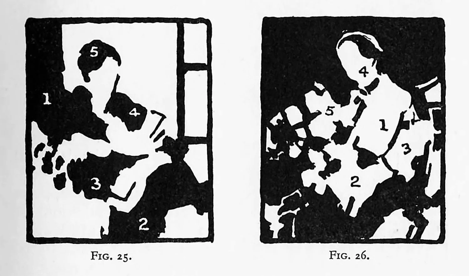
Figs. 25 and 26 show this descent in scale. Such an exercise is by no means easy, for although there are only two tones, it must be remembered that black and white are as unrelated as it is possible for any two tones to be. Many early attempts at dark and light distribution are ruined by the lack of scale. A large blob is made and then a few small spots. Such a precipitous descent in scale—if it can be called a scale—must be avoided by the use of blobs of intermediate sizes. If we can only keep up our interest in these somewhat abstract exercises, without allowing form to bother us, we shall begin to realize the rhythmic relation of space to space, which is scale.
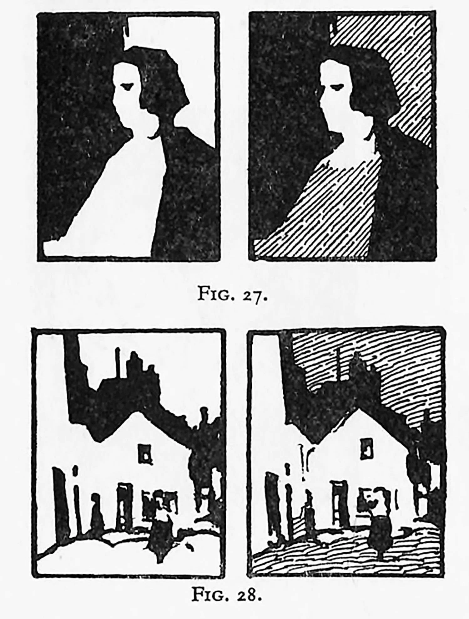
A picture often loses unity through the over-emphasis of interchange, although in formal design interchange may be satisfactory with equal areas and tones. The informal designs used in pictorial work should always be unequal in area and (if more than two tones are used) in tone. If this is not borne in mind there will be a danger of competition between the respective factors of the interchange. The diagrams (Figs. 27 and 28) given illustrate this point.
When three tones are to be used—black, white, and intermediate grey—the problem of relationship is easier, for the eye can be led across the whole area of the pattern, not only by means of scale in the areas, but by the intermediate tone. This intermediate tone can then be considered an additional unifying factor.
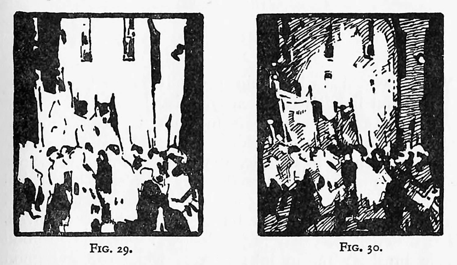
If complete unity is to be achieved it is necessary to link all the white areas and all the black areas. Such a joining up by means of the intermediate is shown in the accompanying illustrations, Figs. 29 and 30, and Plates XVIII [note: this is a typo in the original text. Pearce evidently meant Plate XV] and XIV.
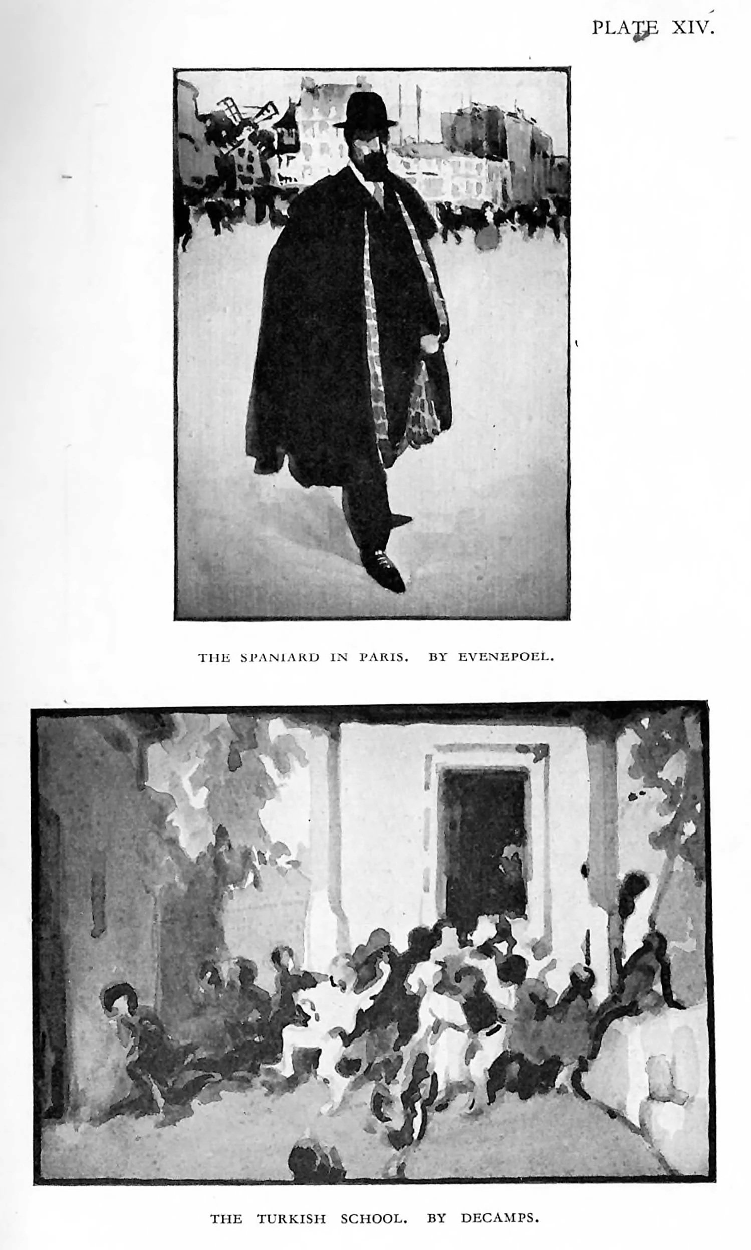
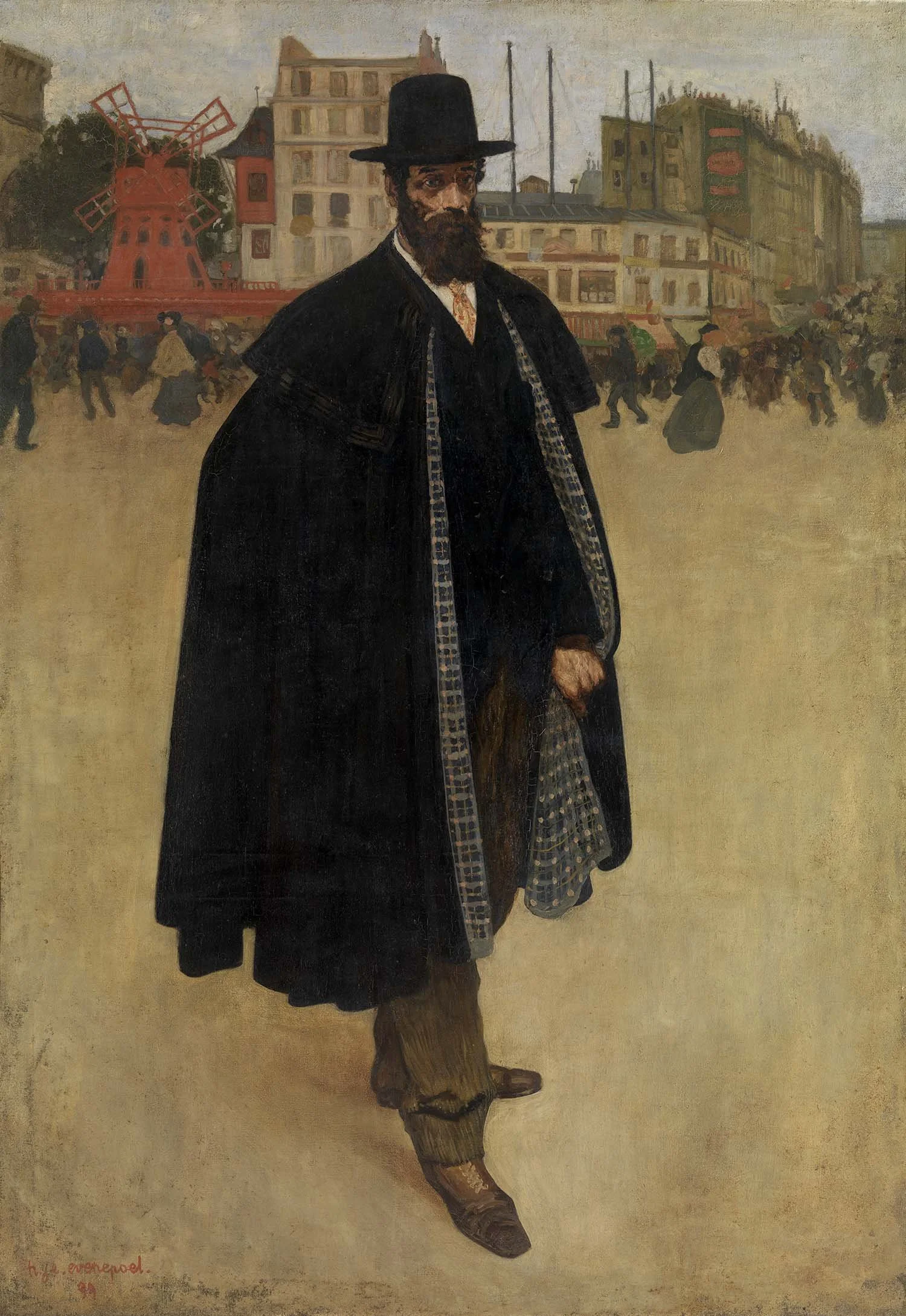
The Spaniard in Paris, by Henri Evenepoel
Note: the original reproduction in Pearce’s book is very poor. Here I have included a clear reproduction.
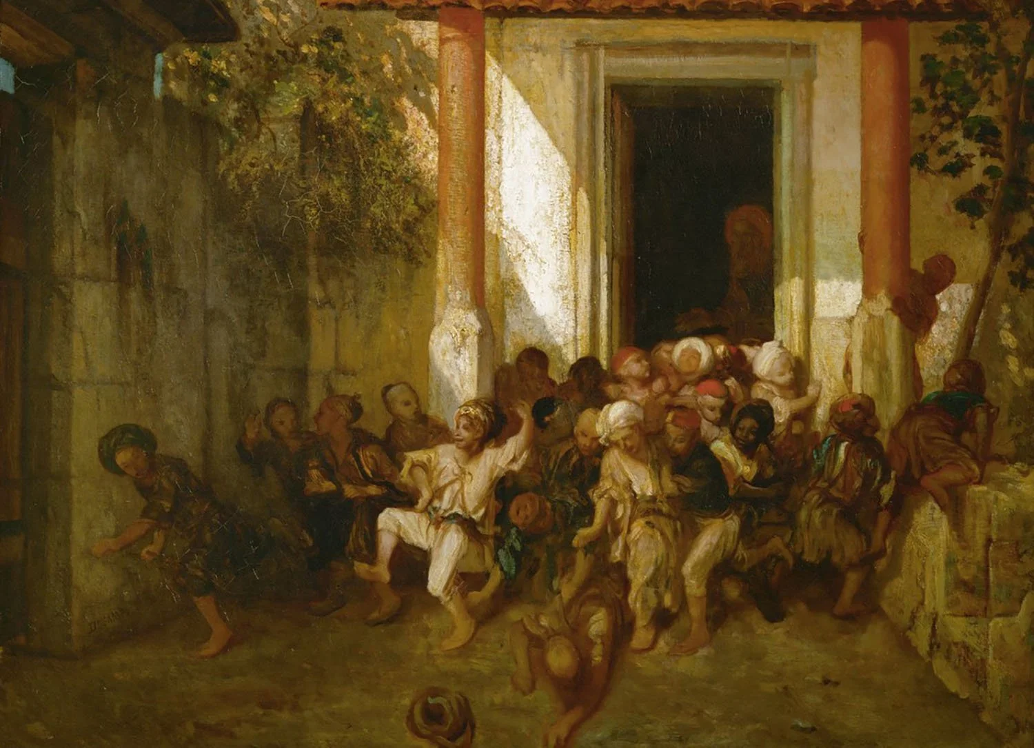
The Turkish School, by Alexandre Gabriel Decamps.
Note: the original reproduction in Pearce’s book is very poor. Here I have included a clear reproduction.
When a large number of tones ate employed the question of scale still holds good, but there is no longer the difficulty of relating the dark and light areas. Such a difficulty nearly disappears with the addition of gradation, and if we also allow the tones to be narrowed in range of pitch—that is, if the tones we use are not very dark or light—we arrive at a condition when our former, troubles have disappeared. We have achieved unity, but, alas! at the expense of vitality.
It should be our aim to avoid the detached, disconnected statement and also the over-united or cloying statement. “The maximum of vitality without losing the unity” might be taken as an appropriate motto. Though the foregoing conclusions may appear to be tedious and unnecessarily abstract, yet the exercises in a few tones that have been suggested are valuable for the reason that the student finds out the real difficulties of tonal construction. His attention is pinned down to the underlying structure. Alongside such abstract exercises should come the tonal analysis of the masters. Pictures or reproductions by the masters should be studied, and after a careful survey of the proportions and areas such work should be simplified by using only three tones in the analysis. These exercises, in any suitable medium, should be small in size. The endeavour should be to see how the tonal factors have been arranged and to appreciate the pattern-sense of such works. Plate XV gives a selection of such exercises.
A certain amount of concentration is necessary. The mind must not be allowed to wander off the track and stray towards intricacies of form or speculate on the colour of a given area. The desire to “finish” such exercises by using additional tones must be resisted; such tendencies to copy will, it is hoped, give way to the desire to arrange a tonal rectangle of our own composition, for even if this personal adventure does not compare favourably with the work of the master, we have at least created a problem that calls for solution.