Chapter V.
GRADATION
Of all the qualities connected with tone, perhaps gradation is the one to which most attention is usually paid by the student. Many of the subtleties observed in Nature seem to call for gradation for their expression. One of the most difficult tasks for the teacher is to divert the student’s attention from this quality in order to fasten it on to the other factors that ate used in the building up of a composition the structure of which is based on “light and dark.”
The moment gradation enters into the scheme a hollowing-out, a three-dimensional vision, almost invariably enters into the conception. Yet it is possible to use gradation in a more abstract manner without becoming too involved, and to preserve the two-dimensional aspect. Many Japanese, Chinese, and Indian paintings testify to this possibility. It must be admitted, however, that there is little chance that such abstractions will become popular with the student living in the Western world, where the realization of a three-dimensional aspect is so gteat an aim. If the factor we call gradation is considered from the point of view of composition, it will be seen that its functions are as follows: (a) Distribution of dark and light without form; (b) the simplifying of adjacent tones by the use of intermediate tones in order to join up and give unity (forms are quietened or hidden by this means); (c) the giving of vitality to a space.
(a) The distribution of tone without form will be readily understood, and need call for no further explanation. The exact amount of tone is governed by the law of distribution and also a rhythmic law—a relative consistency—that will be considered later.
(b) The simplifying of adjacent tones by the use of intermediate tones should be regarded as a step towards unity.
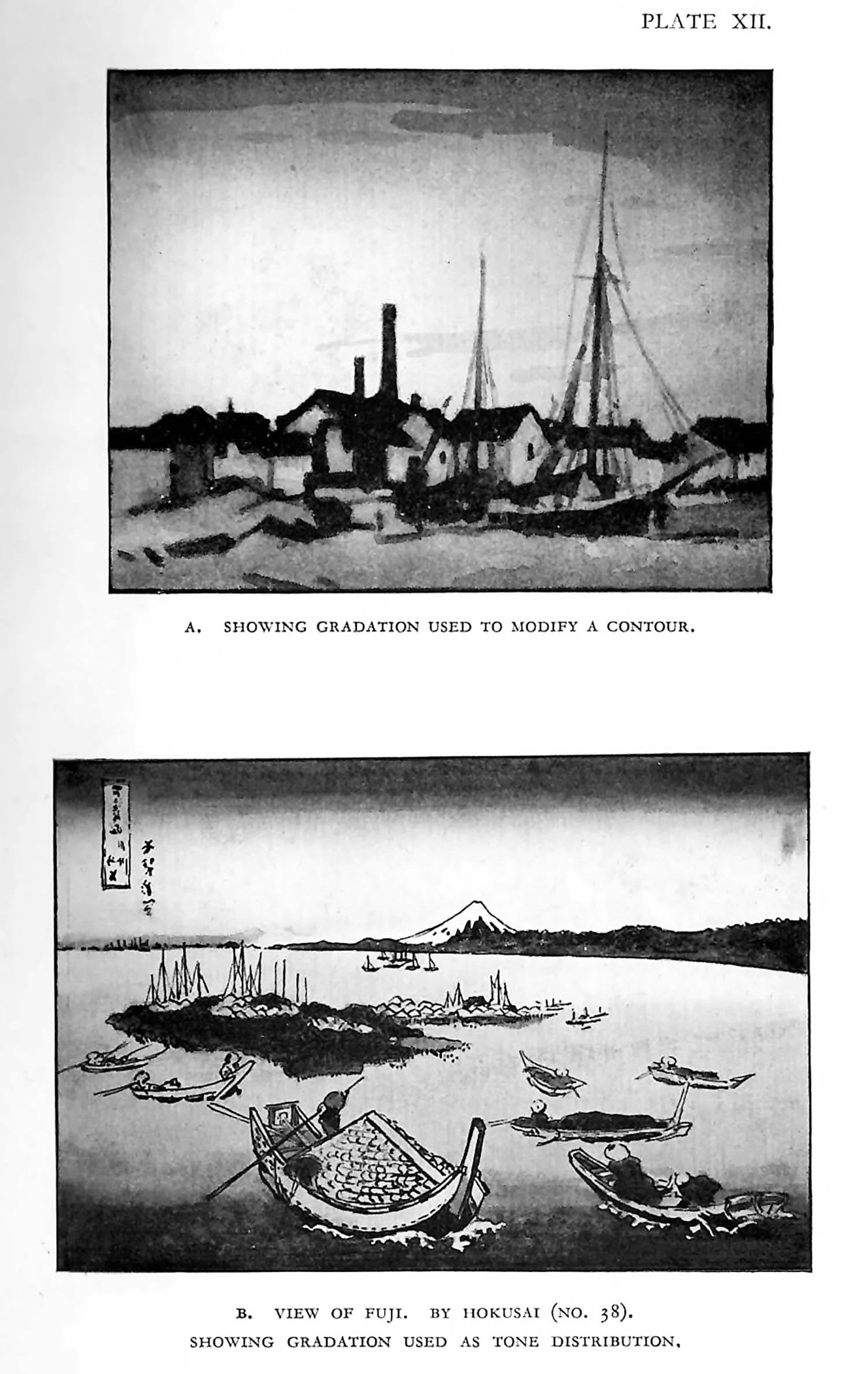
If a simple contour be drawn across a rectangle, and the lower portion of the rectangle made darker than the upper, a gradation on a part of the upper portion towards the dark will tend to unify the two tones, and will put the part of the contour under treatment into a subordinate state. The same effect would result if the lower portion of the contour were made lighter at a position near the light upper half. The illustration A, Plate XII, shows this unifying use of tone. One form of gradation may be seen on outlines apparently unaccompanied by tone.
The representation of form by line is a convention that we have come to understand without question. In its pure diagrammatic condition it represents boundaries of things—the limitations of objects in space. The sophisticated draughtsman, however, is rarely restricted by this kind of line, for, although retaining line as the means, he usually employs a variety of thickness—a losing and finding of the contour. Here he gives a clear, sharp edge—an accent, it may be called—which gradually gives place to a thicker but quieter portion; then he allows it to crumble, double itself, and interlock with other lines. A thousand-and-one-things-happen to give quality to a line or boundary.
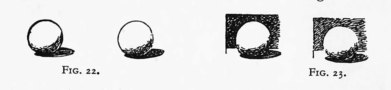
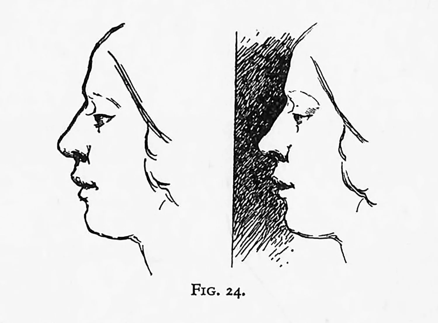
All these varieties are caused by the artist’s desire to express the depth, the way the object goes back and around, the desire to express the three dimensions. A diagram pure and simple only expresses boundaries. If the accompanying diagrams (Figs. 22, 23 and 24) are observed, it will be seen how the line quality can suggest different dark and light values on either side.
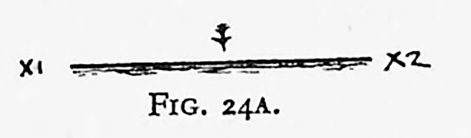
If this explanation be reduced to simpler terms it means that in the line accompanying X1, X2 (Fig. 24A), the side of the paper indicated by the arrow looks whiter than the other side. Thus the effect of tone and gradationis suggested.
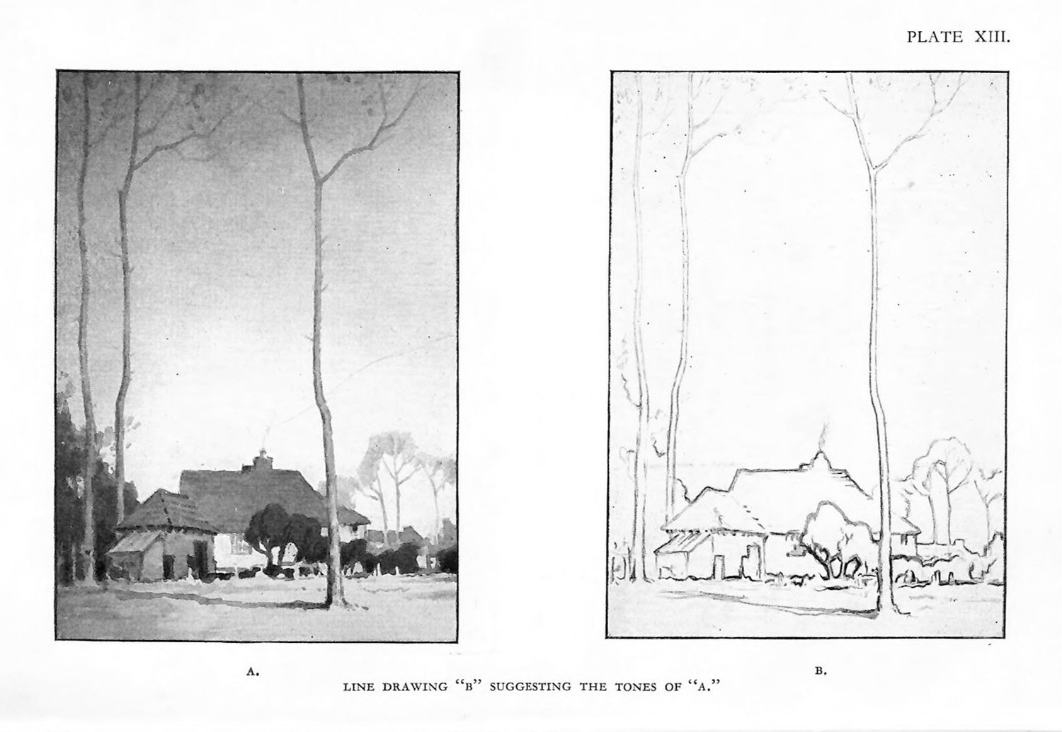
This is a very important quality, over and beyond mere line as such, and it is the real beginning of tone and gradation emerging from the line itself. Even if outline alone is used the vatiety of its thickness is quite sufficient to suggest gradation (as shown in B, Plate XIII, where the outline suggests the tones of A). When we observe this variety of line in the works of the masters, it might appear, at first sight, to be mere caprice, swaggering style, or pure exuberance on the part of the artist. It really means that the artist is interested in line plus tone.
The strength and variations of line are suggested by the varying differences of tone on adjacent sides of the line, in addition to the actual boundaries of objects defined by the line.
A further analysis of this question of tone-suggestion in line would carry the writer and the reader into the realm of drawing and away from composition. The question of edge-study, moreover, has been dealt with very fully in Professor Seaby’s book on Drawing.
The third function, C, which is the giving of vitality to a space, must now be considered.
When flat tones ate used throughout a decoration a certain pleasure is felt in the consistency of such a simple treatment. Cut paper and many other media lend themselves to flat tone decorations. But unless the forms or colours give special aid we find that the condition of fatness causes monotony, and a certain baldness becomes apparent. If the forms and colouts are intentionally nobtrusive something must be done to bring the picture out of its monotonous condition of flatness. This is the question of how to give sufficient vitality to the flat tones. A widening of the tonal scale would, it is true, give more vitality, but would entail the danger of breaking up the pattern. In order to keep the tones of the same value something in the nature of a patina, or surface variation, is needed.
Textures, mottling, stippling, hatching, splattering, and a host of other names, varying with the medium employed, give vibrations of surface. This titillation of surface is another starting-point of gradation. Gradation, as it is generally apprehended, gives a lightening or darkening of tone from a given position. One of the constant troubles in tone-composition lies in the management of this variety of surface. It is more than likely that additional complexity will only take away the simplicity and the unity of the flat tones, though its true aim is to give greater vitality. This is because the gradation is not truly related to the areas.
When gradation or surface quality is given to a decoration the amount or range of gradation should be proportionate to the area.
If a picture could consist of two equal portions, the gradation on each portion should be equal. If a picture consists of two unequal spaces, the larger area should be gradated more than the smaller area. Very small patches in a given composition could remain nearly flat whilst the larger areas might receive considerable gradation.
If this law is not obeyed, a small over-gradated area robs the rest of the picture by monopolizing the attention of the spectator—that is, inconsistency has crept into the composition. Lack of unity has taken the place of general vitality. Many pictures and posters have failed through lack of attention to this relationship between gradation and area. If one walks to the nearest poster-hoarding it will be easy to find compositions with flat patches over most of the areas and suddenly a highly gradated portion—probably the head or the commodity that is being advertised—out of all relation with its environment of flat tonal treatment.
‘The defence of such work is that it gives contrast and attracts the attention to the highly modelled portion. It does, but at the expense of the rest of the decoration. The true decoration is one in which every patch and every area assists in the general scheme, where competition has given way to co-operation. If a certain portion of a painting is intended to hold the attention the effect should be obtained by strength of tone, by form, or by colour, either singly or in combination, and not by the illogical treatment of tone. Every student should endeavour to train his sense of relative gradation. It is not, however, necessary to calculate the mathematical ratio of space to gradation, although this may be one form of intellectual appreciation.
It is better to look at pictures and “feel” how each portion, with its own peculiar subtleties, contributes to the rhythmic tonal arrangement.