Chapter IV.
TONE AREA
The quantity of dark and light and the tange of tone in a picture ot decoration depend to some extent on the medium employed and the environment in which such works are to be placed. The medium and the envitonment have a modifying influence apart from what the artist wishes to say. He invariably finds the medium that suits his outlook, and such influences can be discussed as we compare the accompanying simplified illustrations.
Four compositions by Manet ate shown in Plate VI.
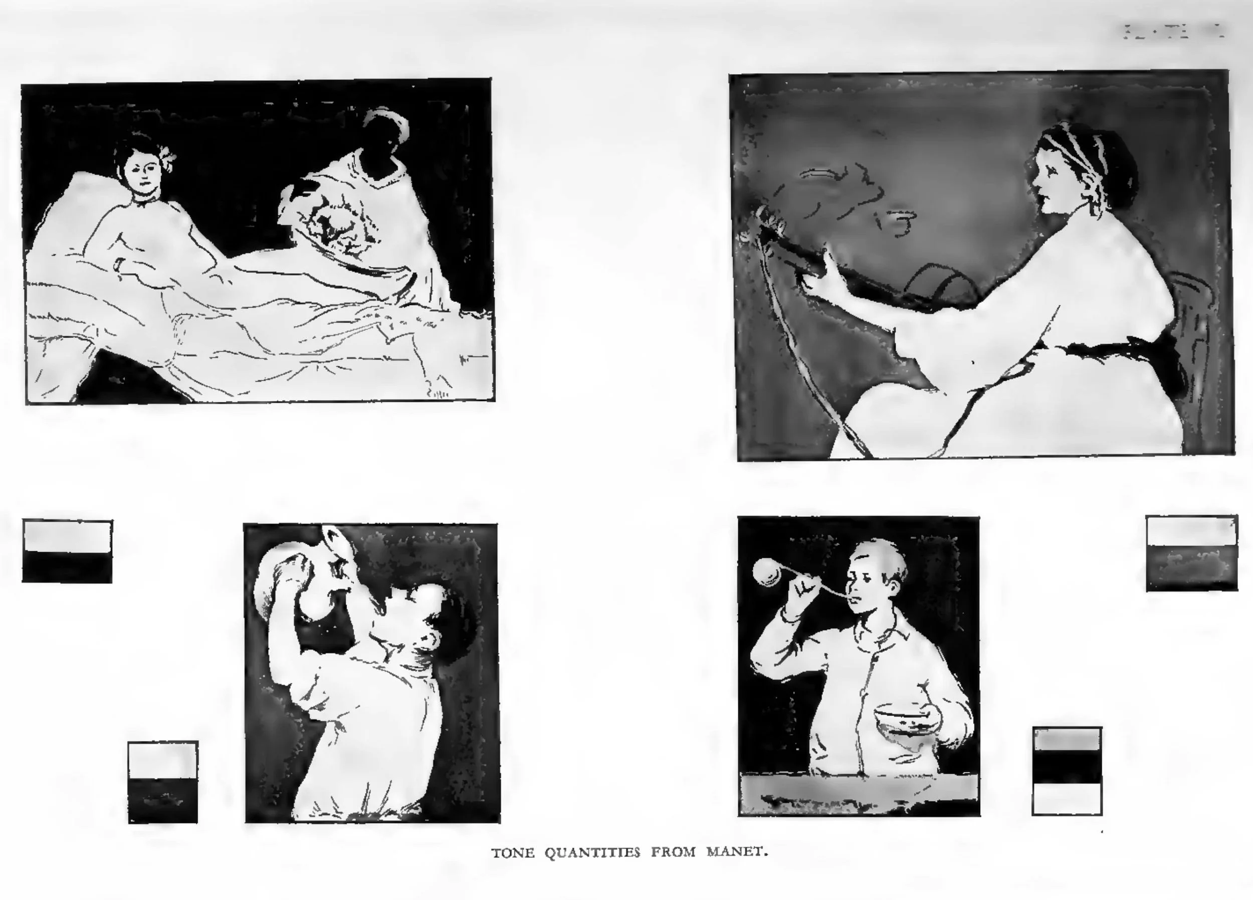
Edouard Manet was a mass-impressionist, and his work possessed good distribution and simplicity of design. His tange of tone was wide and well defined. His areas were arranged, in our examples, so that the dark area approximately equals the light area. When such tones are widely separated, with the areas of dark and light equal and a considerable ptoportion of the ateas arranged to be at these extremes of dark and light, we find that tone achieves its maximum vitality and its most dramatic qualities.
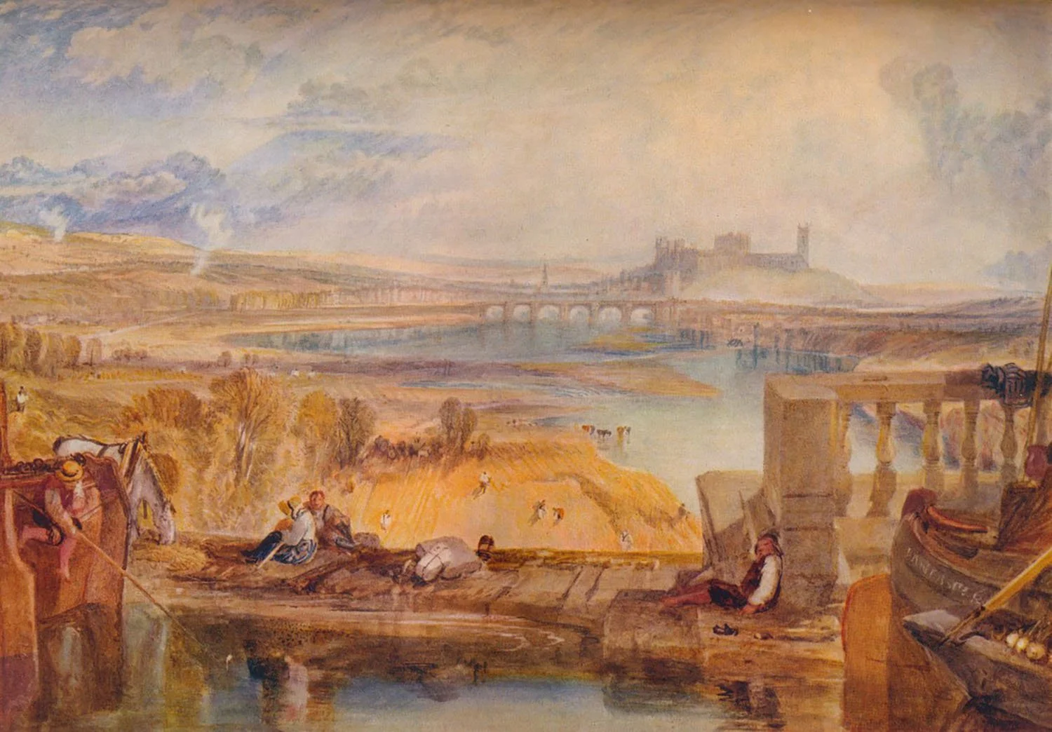
PLATE VII. Lancaster. By J. M. W. Turner.
Note: this is a clearer image of PLATE VII since the original is nearly unrecognizable due to the poor reproduction quality in the original book
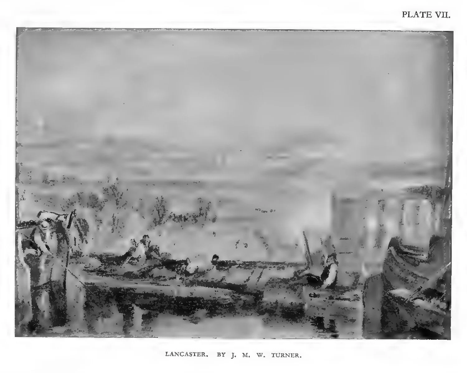
Note: This is the original image as it appears in the book.
In the tone analysis of a ‘Turner, given next, in Plate VII, we find the intermediate tone occupying a larger area than that of the previous illustrations. The extreme lights and darks are proportionately smaller, and such a scheme is not as trenchant in character as those we have just examined.
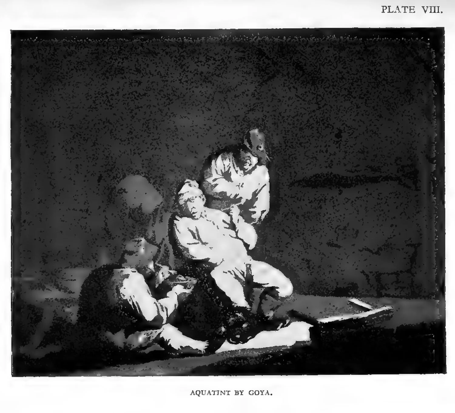
The next illustration, Plate VIII, by Goya, gives us an arrangement in which the darks preponderate, although the tones are far apart in range. Such a scheme, although tending to be solemn, tragic, and eerie in character, has been successfully employed in many portraits. The Duchess of Milan, by Holbein, in the National Gallery, is an outstanding example. Such pictures seem to agree with warm oak-panelled rooms and dark interiors generally.
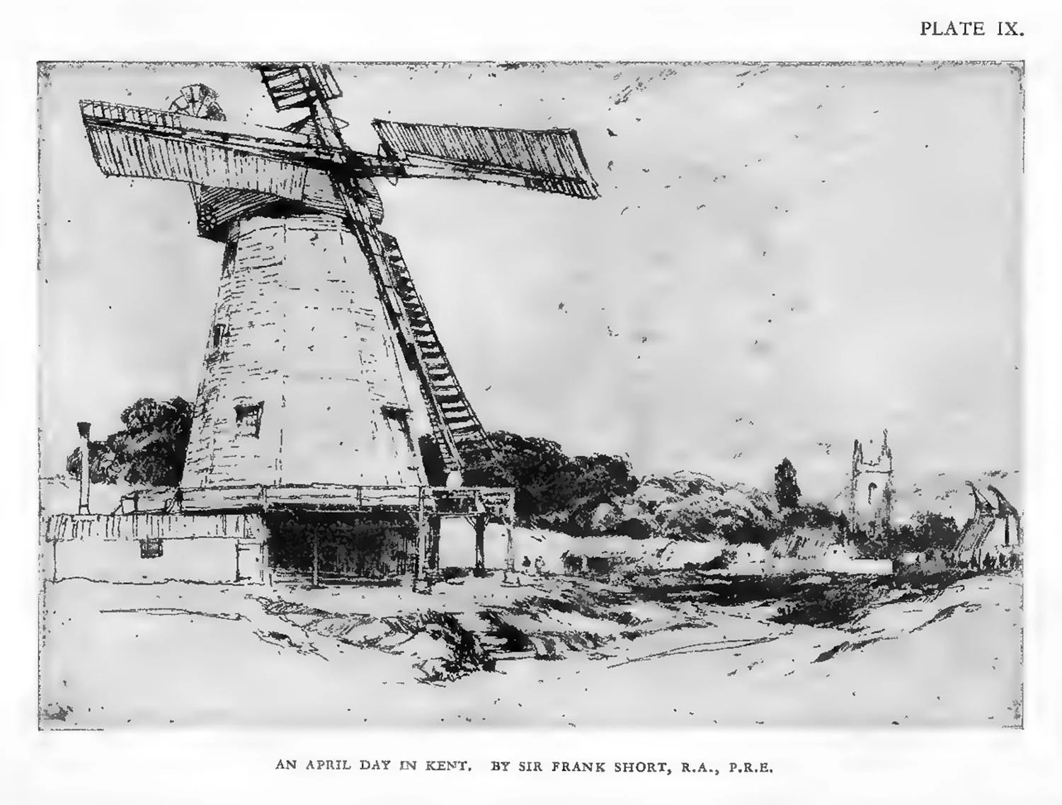
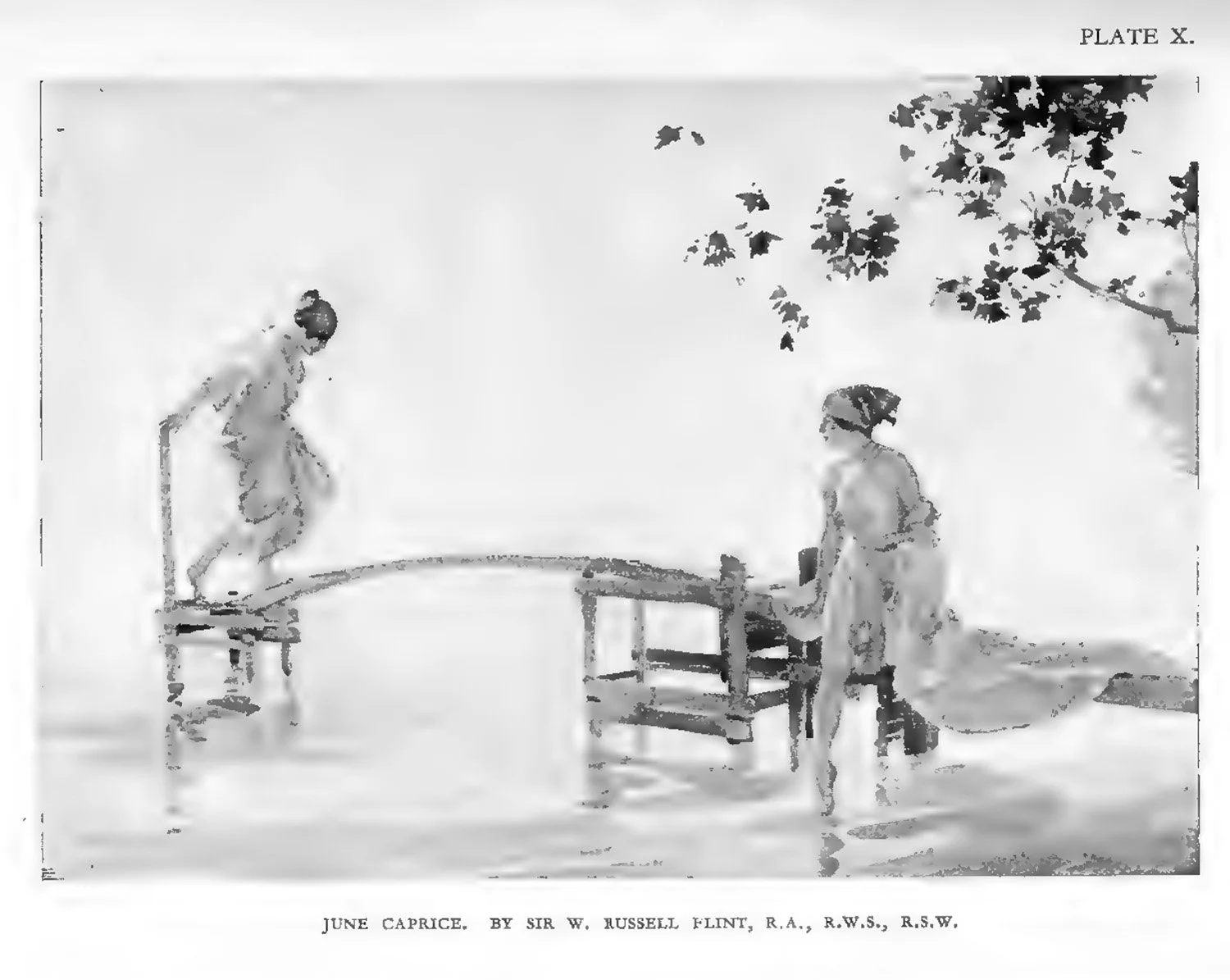
Our next illustrations, Plates IX and X (an etching by Sir Frank Short, R.A., P.R.E., April Day in Kent, and a watercolour by Sir W. Russell Flint, R.A., R.W.S., June Caprice), give us schemes in which the tones are widely separated although the light portions preponderate. Perhaps the best etchings and water-colouts have this quality in common, for these media naturally lend themsleves to such proportions of tone. Our modern, cheerful, light-filled homes are admirably adapted to house such works, for they agtee in general tone with the light walls they decorate.
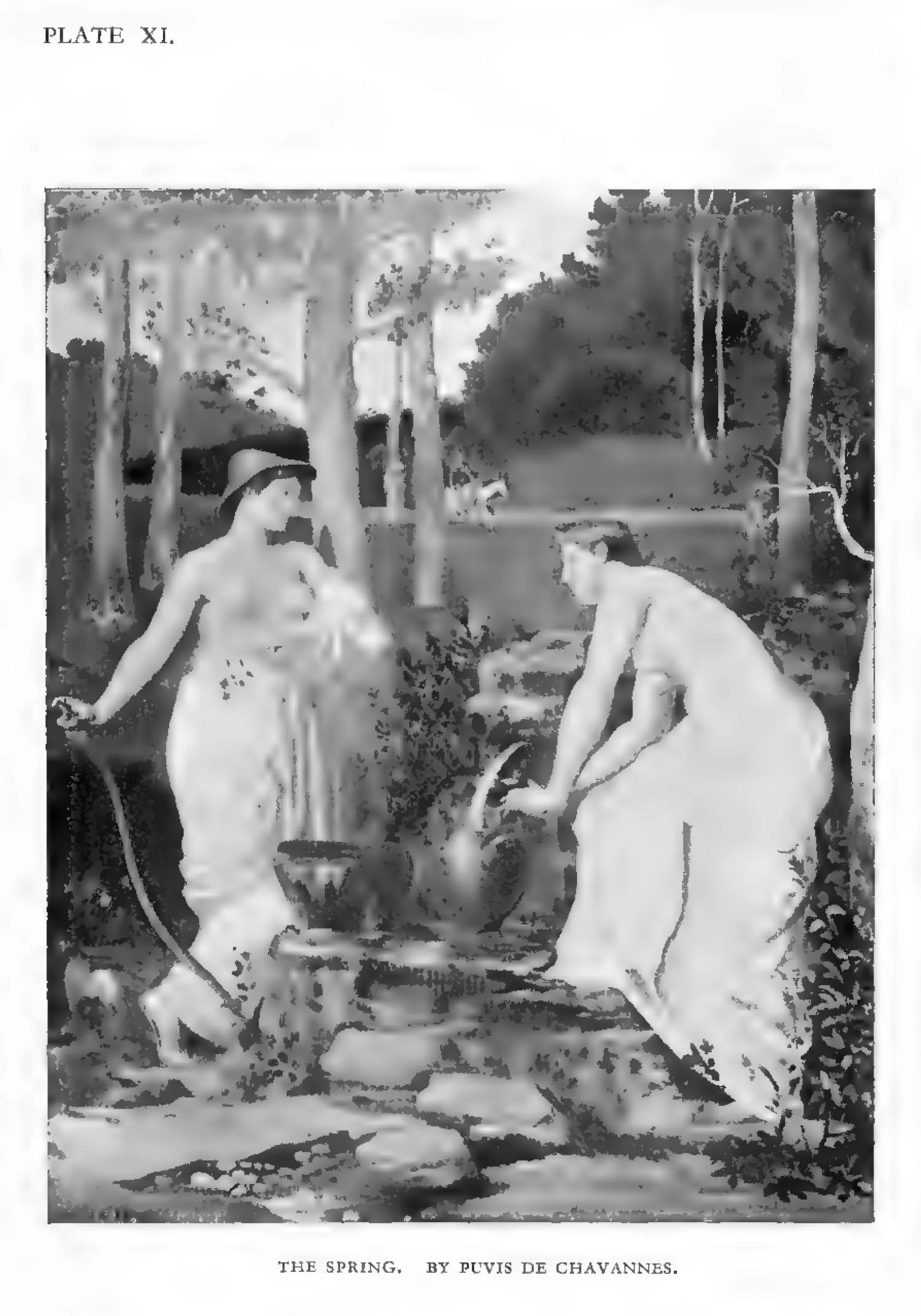
Now let a decoration by Puvis de Chavannes, Plate XI, be considered. The tones are not wide apart, and the general effect is light. Experience has shown that such an arrangement of tone in which the light preponderates is eminently suitable for mural decoration. The whole surface must be visible at once. Strong darks on such a large, light surface would destroy the repose. The tonal vitality that must of necessity be sacrificed gives place to other qualities more suitable for such a position—contours, interesting forms, and delicacy of colour.
A very small picture can be wide in range of dark and light; it can even be allowed aggressive snap to make up for its diminutive proportions. Just here, it should be noted, is a gteat stumbling-block for the student who enlarges such a sketch. The range of dark and light becomes increasingly intense as a picture increases in size. A narrowing of range is consequently called for.
When we give up any artistic quality such as tone, there must be an aesthetic compensation.
A good etching, thus considered, is a filigree pattern of line full of delicacy and intricacy. The tone distribution is usually confined to a few masses of black—pause-points, as it were—giving quietness in order that we may more fully enjoy the line. A piece of black lace on a white ground would give similar decorative qualities. Here, then, we find that what has not been attempted in tone is compensated for by line. Similar arguments might be put up with other media, but enough has been said to suggest that whatever medium is employed, whatever environment is given, the aesthetic “content” must be the same and the vitality under any circumstances must also be equal.
We shall gather from the foregoing remarks that when a picture is dark in character, the tones preponderating towards black, and also narrow in range, our chances of making such a pictute a success are very small. The dark tones hide any attempts to compensate by means of form and colour. Most students who have attempted to paint a picture of a night-effect will understand this difficulty. An inspection of Whistler’s nocturnes will teach us that a transposition of Nature’s dark range is necessary in order to avoid dullness and monotony.
It is more than probable that all that is seen requires transposition, for the range of tone in Nature is so great and the best possible pigmental range is so small that the most stubborn of realists—or, to put it more accurately, naturalists—is inevitably driven to an esthetic translation.