Chapter I.
TONE
It is the writer's experience as a teacher that students consider form and colour at the expense of the more abstract factor of tone. For that reason the question of tone has been treated first.
The word “tone,” although capable of many different meanings, has been selected because of its brevity. If tone be defined afresh no misunderstanding need arise of the exact meaning attached to the word in these pages.
Tone is the dark-to-light scale, extending from black through intermediate greys to white. In thinking of tone in relation to pictures and illustrations generally, it is necessary to realize that it is the factor contributed by the dark and light in the work. We should put out of the mind all the confused ideas that surround this simple word. Terms such as "modelling," "gradation," or "light and shade" are possible, but not necessary, factors of tone. Unfortunately, to the student who has been taught to draw, to define shapes and fill them with light and shade, there is ever present the dictatorship of the immediate natural observation.
Pictures known as decorations, or even decorative in character, are often looked upon with suspicion by the copyist. He feels that there has been some arbitrary modification of things as they are seen naturally. A picture, however, as far as composition is concerned, is a decoration first and anything else second. If it is not a work revealing interesting pattern, if it is not an esthetic joy "to look at,” then it fails in what should be its essential quality. While the student may see natural forms at a given moment, yet, lying apparently dormant in his sub-conscious mind, is the residue of the past visual impressions-what may be called visual experience. When this faculty of memory begins to awaken, the student is no longer satisfied with a mere transcript from Nature, useful though that may be as an exercise; he attempts to create pictorially an arrangement from Nature as modified by this sub-conscious memory. This pictorial adventure constitutes what might be called a "liberation" from the immediate or direct observation.
Thus, the instant that certain imitative shackles are thrown off, the restraining influence of the rectangle, or the enclosing shape of the picture, comes into action, and the problem becomes one of showing visually our impressions of life as arranged within this limited space. Every picture painted by a master is a world in miniature, complete in itself.
The moment a student draws anything, his sense of composition, or absence of it, asserts itself by the mere placing of his drawing on the paper. He begins to arrange his material, and this process goes on; gtadually he finds new and more important truths about the familiar objects he draws. The final development occurs when artists arise who create pictures showing us a world quite unlike our visible world, peopled by figures and beings never seen by the physical eye. Turner, in his later phases, and Blake, with many others, come under this category.
It is important to remember that the sense of composition, of pattern and decoration in tone, line, and colour remains constant. Although pattern may be said to be inherent in the human mind, it must be admitted that much art study, necessary in giving the student the power to differentiate and characterize, does tend to blunt the perception of relationships, and pattern implies relationship.
One of the first things that must be grappled with is the essential difference between “light and shade” and “dark and light” as it is understood in composition.
If the four illustrations, (A), (B), (C), (D), Plate II, are examined, we find :—
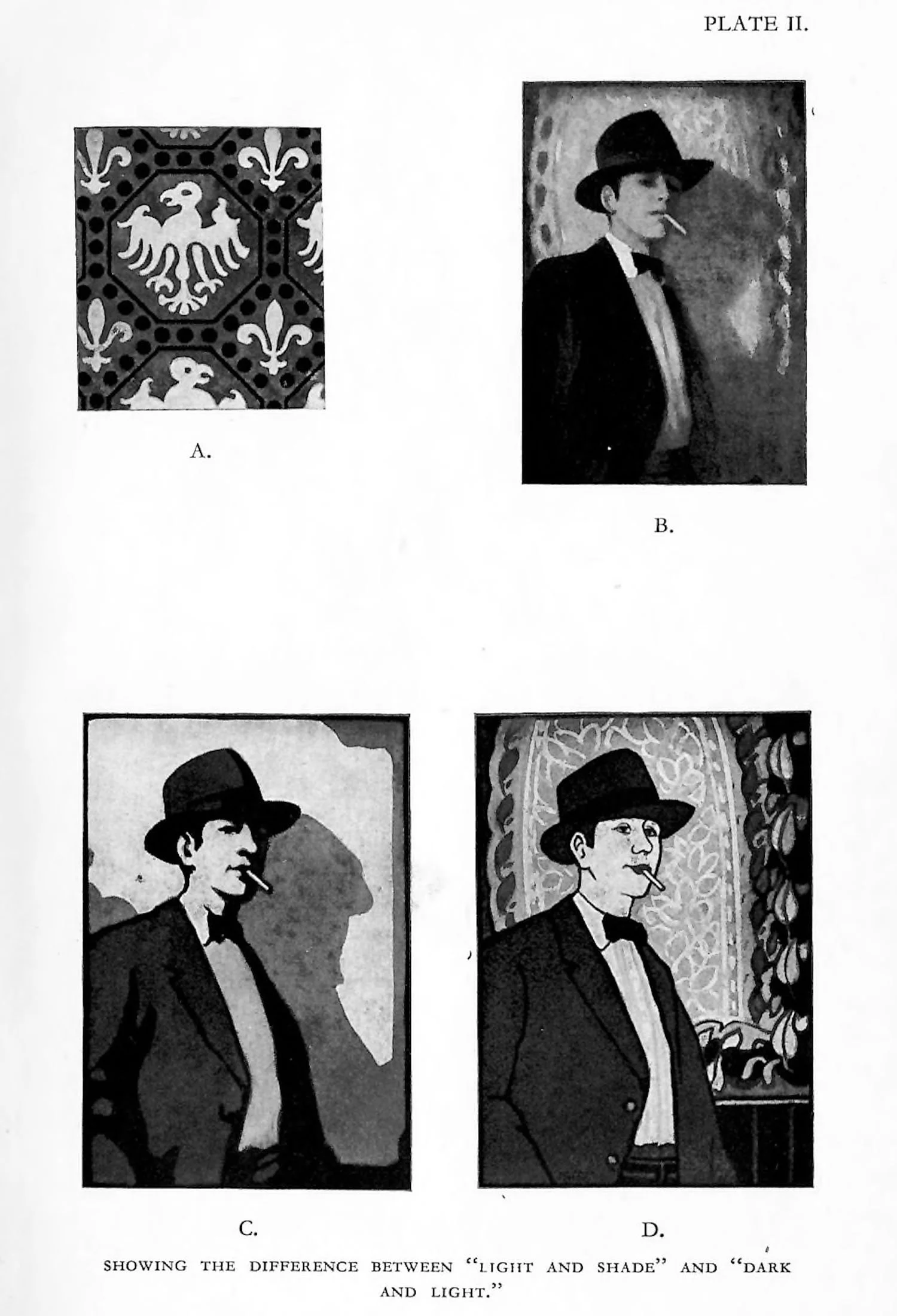
(A) A formal arrangement, with the qualities of flat or two-dimensional decoration. (B) An informal arrangement, suggesting depths photographic in character, a three-dimensional decoration. (C) A simplification of (B), but still retaining the three dimensions. (D) The same informal arrangement as (B) and (C), but treated in the two-dimensional manner of (A).
Such types as (A) and (B) are familiar to us, (A) with its flat decoration of dark and light tones and (B) with its illusion of space given to it by its light and shade.
It is in (C) and (D) that the confusion often takes place. (C) is still giving the illusion of depth, for the contours on the face and other forms are “derived” from light and shade. They are “shadow forms,” and in consequence only a simplification of (B). (D), however, is a return to the two-dimensional condition of (A), because the shadow forms have been eliminated.
Dark and light exist in all four of the illustrations, but light and shade occur only in (B) and (C), and it should be clear that (1) “dark and light” exist in all decorations and pictures; (2) Light and shade exist in some decorations and pictures. Hence “dark and light,” owing to its inclusive character, is the real bed-rock term for any true discussion of tone in composition.
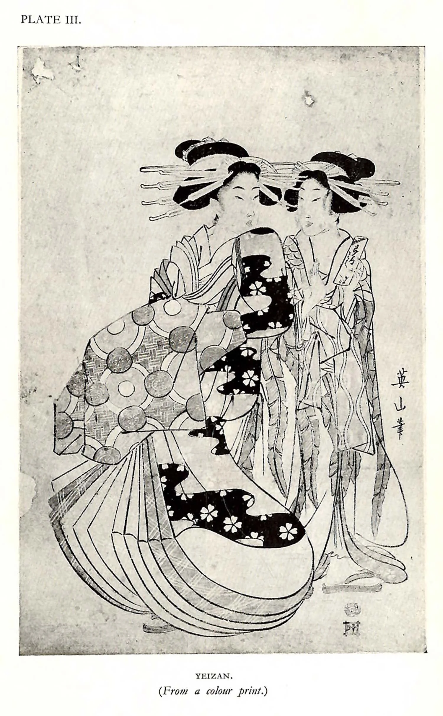
The pictorial works of the Japanese, Chinese, and, indeed, of most of the Eastern world, are confined, for the most part, to the condition implied in diagrams (A) and (D); that is to say, depth, perspective, and three-dimensional representation has been avoided. Plate III, a colour print by Yeizan, illustrates this condition.
As we shall see later, gradation in Eastern att is used to distribute tone, to improve the pattern rather than to express modelling or rotundity.
The art of the Western world has merged pattern with three-dimensional observation. The Western masters imagined that depth, the illusion of space, the subtleties of close observation, and the underlying sense of pattern could be successfully welded. Yet, even in the West, the Primitives, and many of our Moderns, have felt the joy of working in the more abstract two-dimensional manner. It is not the immediate business of the student to make a choice, but it certainly behoves every worker in the fine arts to know the true nature of decoration.